 After looking at more psychological thriller posters as I felt that I was shifting away from our genre I realised that most posters seem to have there masthead placed in the middle and When I try that our poster seems bland at the top area. I'll place the slogan there, however it would just look weird and misplaced. This is why I created a puppeteer at the top to create something more interesting and to fill in the blank face. The hands were a separate image and I had to find a suit that I can lower the opacity to fit in the background and create mystery to whose controlling the strings. This gave me an easy option to place the slogan beneath the masthead and gave it a red colour to draw more attention.
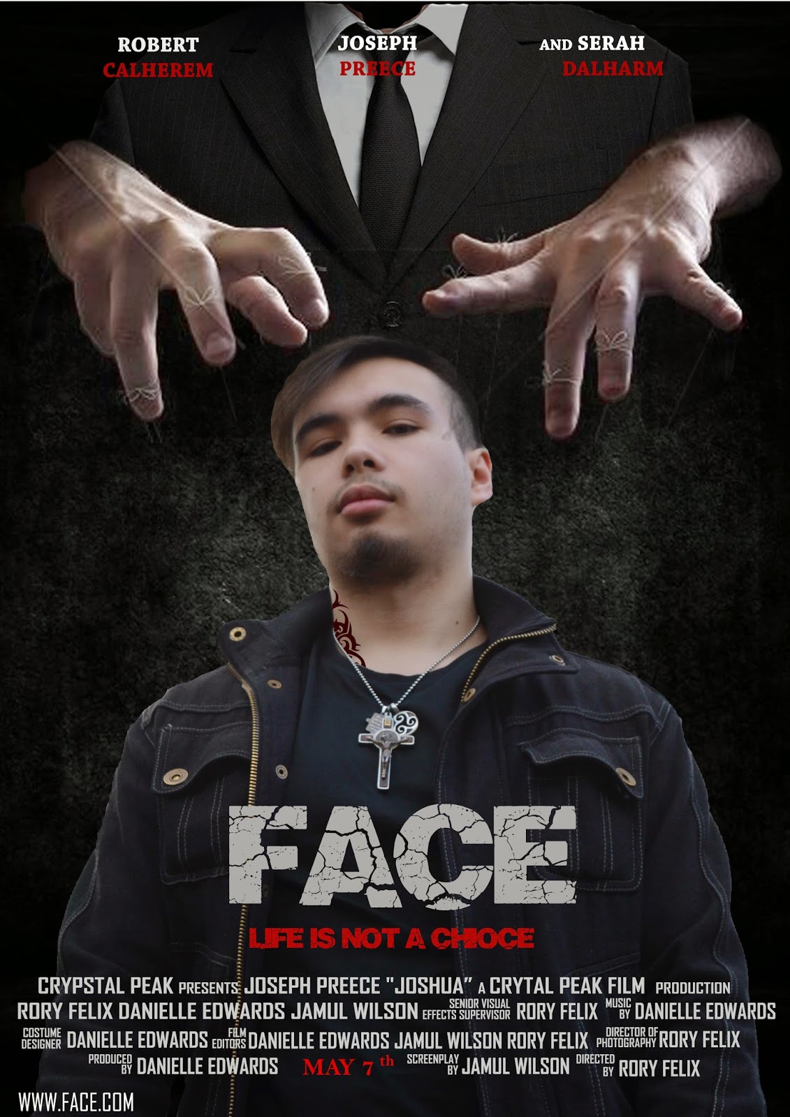
 The star names are better to read and I like the use of the white and red.
No comments:
Post a Comment