Tuesday 30 December 2014

Magazine Sketches

Following the conventions of a film poster, I looked at the conventions of the poster titles, taglines and image to begin the layout. Below is a few images of examples of layout
I have an idea for. After getting feedback on the magazine  and seeing that the previous ones Were quite mainstream, I made a new sketches mimicking a more independent Magazine.  The image remained in the middle and the name of the film but I removed all
sell lines the only convention I did follow was the bar code being on the magazine but I  made it un - conventional by putting it horizontal.  I’m going to put the names of the directors and actors on the bottom. The background I’m going to use matches what I used in the trailer.

Wednesday 17 December 2014

Mood Board Magazine

I made a mood board full of independent magazines to give me inspiration about making  my own magazines. I used the ides of smaller fonts on the sell lines and the larger masthead.  It keeping everything I used minimalist and a to smaller standard.   All the magazines are unique and different which gave me the freedom to make daring decisions when coming to the magazine. 

Tuesday 16 December 2014

Title Development

Title Name
After a brief discussion of names for our film, we needed a title to relate towards our film. With a look over the plot we came up with choices as a working title for now.

The look
We discussed how we would like to picture our title coming in. We don't want a plain text that enters or has a flashy entry with beaming lights or such. We want our title to have a build up, dark, and build tension by its own devices.
After searching around for a template for us to be inspired from, We like the idea of having our title launch out towards the audience letter by letter, however during testing I had the problem of getting the individual letters come forward instead having the whole text would. I came across a video that teaches how to make a text with the individual letters come forward which helped our progression and taught an advance way to make the title in a 3D camera view.

Production Logo

Logo
Like other examples from a previous post where we collected what other companies logos are, we gathered that the majority has a simplified drawing of their name. For example Blackwood Pictures has the image of a forest, or another example is Summit Entertainment has these curves that symbolises a summit. Other companies do have another similar design such as triangular shapes to form their logo, examples being The Weinstein Company and Spectrevision. Since are name consist of objects we could go along the lines of having our title simple and a image relating towards our name.

Fonts
After looking at other comparisons we saw that most lean towards a serif font with everything in capital letters. This can go for a more stylish look, while highlighting the name thus grasping attention in a smooth way. Other examples like Spectrevision use a sans-serif font which is bold and stands out. The font size is smaller than the logo, however the because of its bold appearance it still makes itself present. 

Brainstorm company logo name
After a selection of different ideas to name ourselves we needed it to all agree with it but most importantly if it will stay with the audience. After  reading a selection of the names we came up with Crystal Peak Production was soon the creation to be made with the majority of our class agreeing and after researching other company names we realised ours does come to a similar theme and we all feel it’s a name that is memorable.

Test
We wanted our logo to have the text appear letter after letter and then the design that would establish ourselves transits itself in.


Thursday 11 December 2014

Magazine front cover images from photoshoot


 These are the images for the magazine cover, we used dark clothes for his costume because he's suppose to have a dark atmosphere around him due to the fact that the teaser trailer represents him a dark way.
We used medium closes up to get his full costume and to see his facial expressions properly. We also wanted him to engage with the audience with his eyes while his image is on the front cover.

If I want to remove the background from the photo and just have him for them magazine i can just use lasso tool on photoshop.


Existing Teaser Screen Grabs


This image is from a horror film 'I know what you did last summer too'. We thought that this image would relate to our movie trailer because firstly this camera shot is very powerful. It's an over head shot (when the character is laying down) where the main protagonist is looking directly at the audience 'breaking the fourth wall' and letting us see or listen to there story.  We thought that this shot will would be very useful
in our trailer.


This is another image from official trailer of  'Sinister'. In this trailer they kept on going back to symbols which relate and are an important part of the narrative in the movie. In our film our protagonist has a symbol on his arm and that is a key part of information, so through out our thriller trailer we two will keep cross cutting images of symbols.


Where going to be playing with lighting in our trailer. There is going to be a lot of darkness which key bits of spot lights when needed. This long shot taken from 'Black Swan' is the type of shot that we are going to take of our protagonist. We like the idea of the lights only being on him highlighting his importance.

Wednesday 10 December 2014

Screen grabs from existing teaser trailers


All the trailers here are from Hannibal Rising, Hannibal, Red Dragon and Shutter Island                                                          

These are screen grabs from Red Dragon and Hannibal Rising. The title that says Red Dragon the trailer i like because it blends in with the background well. I also liked the tattoo they showed on the back which is a hermeneutic code because the trailer doesn't explain the meaning of the tattoo or it's purpose so my group and I can take this into account and use it in our trailer. Furthermore I like the close ups of Hannibal Lecter in Hannibal Rising where the blood is on his face because this use of cinematography clearly shows the expressions of his face which gives the audience an idea of this character or their personality which can show that he's crazy or just psychologically unstable. I like the use of the titles on Hannibal Rising trailer due to the way it creates an effect with the eye.

The use of the focus pull in the science laboratory in Hannibal Rising I liked because at that moment of the trailer someone was trapped and drowning in water so the use of the focus pull makes it seem like that he's losing life and slowly dying and his eye sight is becoming less clearer which is what the focus pull is suppose to represent.
I like the close up of Hannibal Rising while he's holding his weapon because it gives an insight of what is going to happen in this scene due to the weapon representing violence and danger.

I can apply this information that I've researched and use it in our trailer by using a hermeneutic code in the teaser trailer which limits information and makes the movie more intriguing. Furthermore we should use cinematography like focus pull to blur out the scene to make it more mysterious like the Hannibal Rising's scene. Close ups should be used in the trailer to show the clear facial expressions of the character being presented which will contribute to the atmosphere of the movie.
With the trailer titles which is a convention for trailers we must be able to use them effectively and support the trailer.


Friday 5 December 2014

Locations for filming

 These are potential locations for the filming because we need a bathroom with a mirror due to the fact that at the end of the teaser trailer he will be looking into the mirror starring at his tattoo.
Furthermore it has great lightning within the scene because if the room is too dark then the lightning within the recording wouldn't be clear and just too dark which makes it to harder towatch.
This is another potential mise en scene locations because it     has a bed and we have easy access to this location.

Thursday 4 December 2014

Magazine sketch 4

With this sketch I decided to do a layout that is influenced by little white lies, so I left out sell lines and put a masthead and barcode. With this I only focus on the aesthetics of the product.
The only thing is that is different that I placed a triangle in the middle of the circle, I did this to make my version have an unique element.

Sounds research


 During the process of constructing the animated storyline, I did extra research for sounds and the reason is because I want to have clear, distinctive sounds that can co-operate with the storyline and help the scenes be more clearer. For example if a glass is meant to drop then the sound can automatically indicate that the glass dropped or with one of our scenes, the main actor is sleeping so I would use the snoring sound to indicate this happening.

Furthermore using sounds will have a high possibility of helping my group and I on using sounds during the trailer so it will be also preparing us before filming the trailer.


Sounds that I have, used: Drill, snoring, and glass shattering.

Magazine sketch 3

With this sketch all I did was chage the layout of the house style so the sell lines will be equally balanced on both left side and the right side. 

Magazine sketch 2

With this idea I changed the layout of the house style for example sell lines. I placed it at the bottom of the magazine.

I used this magazine from sight & sound to influence this design so I placed the sell lines at the bottom just like this magazine and made the image bigger. I also placed a white outline on the edges of the magazine just like sight out sound. I placed my small phrase at the top of the magazine.


Magazine front cover sketch


Wednesday 3 December 2014

Film poster sketch 2

With this sketch I didn't include the credits to see how it looks. I added all the dashes at the top which is suppose to be the actors/actress names. I included the tattoo in this which is a hermeneutic code, this will help link the poster and the trailer together. This poster is influenced by the red dragon poster.

nnn

Tuesday 2 December 2014

Storyboard Part 3


Storyboard part 2


Difference between trailer and teaser

Trailer and teasers are both used to build a hype around the movie and to make it more intriguing for the target audience. However there are significant differences between a trailer or teaser.

Trailers are normally around 2 minutes with a variety of difference scenes and dialogue amongst a variety of different characters where as teasers are 1 minute long and show a short length of sneak previews in the teaser. While examining a teaser and trailer the trailer gives more detail on the narrative to the target audience about the storyline or gives the audience a clear understanding of the structure of the storyline where as the teaser doesn't relevantly need to, it just has to show short length sneak peaks of scenes to build a hype around the movie. The teaser still may give brief clues on the storyline and a teaser may still be just about longer than 1 minute but are definitely under 2 minutes. They may also have dialogue as well.

Cinematography
Teasers would use medium close ups or extreme close ups to show the emotions on a characters face while doing a quick shot of the character to create an atmosphere that could build up more of a hype around the movie. Trailers would also use medium closes up but they would use edits as well as such as shot reverse shot to show glimpse of dialogue between characters. Teasers use low shots as well to create this tension within the atmopshere such as the teaser for Hannibal Rising.


Draft One: Magazine


When making my magazine I realized it was an independent magazine and not a mainstream product. This meant I had to remember not to add many sell lines, or puffs. However, I keep the conventions like a masthead, bar code, and web address. So I also set up guidelines to help me keep everything  professional and keep all texts in line with each other. 

Fonts Ideas/ Logo and Picture Ideas


Our name is crystal peak productions, so I think that it would be interesting if we associated the picture of a crystal and mountain peaks in our company pictures. I like the black background because you would be able to see the pictures of the crystals more defined. I also think a black back ground will look more professional and as if this is a real production company.  This simple design wouldn't attract too much attention if it was on other platforms for example: magazines or posters it would allow the other images to still be seen.


I came across quite a few fonts  and they all had the same
thing in common they all where clear and easy to read.
They where also all sans serif,I think its important to have a cleat font so that you can real it straight away which saves any confusion for the audience and the name for our film is called FACE so that needs to be bold and memorable when you see to have an big have an impact.


Story board one


Trailer Synopsis

Our Trailer Plot:

The trailer begins with a young boy sleeping in bed. He is having a nightmare, we then have various shots of kidnappers in a private warehouse doing experiments on him. They seem to be speaking in a different language and but there voices are drowned out by the boys screams. We then flash back to the boy in bed who is shacking because hes affected by the nightmare he is having. We then have a montage of violence when the kidnappers psychically abuse the young boy, we see signs of struggle and resisting. We then have a close up of him in bed. Then cut to a wide shot of him on the floor and we see the kidnappers feet walking away (having finished with the boy) and we have a slow zoom to the young boys arm where we see a sign of triangle, then we cross cut to an older version of him self looking in the mirror with the same scar on his arm. And he has no memory of how it got there or what happened to him.

Monday 1 December 2014

Film poster sketch


While drawing I used the black swan Natalie Portman film poster as a guidance so I include the conventions of a film poster which is the credits, the title. I included the actors name so people can be informed on who is the actors in the movie. I included coming soon at the corner of the film poster so people can be informed plus film posters always include a date or the sentence 'coming soon' and I placed the productions name 'crystal peak' at the bottom left.

Thursday 27 November 2014

Questionnaire Feedback

Questionnaire Feedback < Click here to view

I conducted a questionnaire to my target audience to see what they enjoyed when watching a horror/thriller genre. Even though we have changed our genre to Psychological Thriller some of the feedback given are still relevant and will still help us when shooting are film trailers.

I asked the audience when watching a thriller, would  they prefer to discover the whole story line. The majority of the people said no. This shows us that audiences enjoy a bit of mystery and a sense of surprise when watching a trailer. They prefer for there to be something to look forward to when watching going to watch a movie.

This is good information for us to have because now as a group we can deiced on how much we care willing to  reveal about our narrative.


I asked, 'what scares you the most about a horror/thriller film' and the most responses we got was from the music. Apparently what scares audiences the most is the music followed by the mise - en - scene. The music is something that we will take on board because we want for tension to build however, we still want the narrative to be heard. So we could lower the music to a slow piano have a non digectic soundtrack and it could peak as the trailer progresses.

However, the mise - en - scene I wouldn't say matters as much now that we are doing a psychological thriller. We are going to use local setting for example: Stratford Westfield, Park, Schools ext .,


Most of the feedback given was from a female respondents. Even though Psychological Thrillers are watched by both genders. However, basing this on our questionnaire we are going to have a male protagonist which will appeal to the female gaze and would want the female viewers to watch more.


'My Favorite Film is SAW' 

This is what most respondents said when asked what is your favourite horror/thriller movie. I think this is because of the narrative used in SAW it isn't just about a killer is has a storyline to why he is the way he is. And I think audiences enjoy that, So we will be taking some aspects from the SAW trailer (cinematography etc ..) and put that in to out trailer.

Monday 24 November 2014

Roland Barthes


Semantic Code:

This code refers to parts within in the text that suggests or refers to additional meanings. This is very common with Psychological Thrillers usually they have multiple narratives that the audiences may not all understand by just viewing the trailer alone. For example 'The Butterfly Effect' This is movie have several narratives that audiences might not all understand in by just watching the trailer because he does have a troubled and difficult childhood.

This is something that I want to put into our trailer as our main protagonist does have a past and I want the trailer to not show all of our protagonist secrets but do hint at them.


Hermeneutic Code:

This code relates to a mystery within a text, clues are dropped but no clear answers are given. The Hermeneutic code is mainly to frustrate the audience making them what to know more. An example of this is 'I know what you did last summer too'. This teaser trailer bring the audience in with there fast cross cutting scenes to previous killings, we hear the protagonist talking about how she is scared that someone is wanting to kill her. Every cross cut that happens the non diegetic music changes to a loud screeching and bangs. This brings in the audiences making them want to watch the whole movie.
This code is something that we are going to put in to are movie because we want the audience to have the sense of fear and mystery when watching our trailer.


Film Trailer Analysis: Black Swan


Black Swan is the psychological thriller movie I have chosen to analysis. It came out in 2010 and it develops and challenges the conventions of the stereotypical thriller movie.

The first shot we see is a long shot of a ballerina dancing gracefully across the dance floor, she is dressed in white communicating pure and innocence to the audience. All that is is on her is a single strobe like from above. The atmosphere of the movie is confused at the moment because the audience doesn't know what to expect. However, the audience would get a feeling that the trailer is going to take a turn for the worse, in the voice over we her the ballerina say “I had the craziest dream last night. About a girl who was turned into a swan, but her prince falls for the wrong girl, then she kills herself.” 
This is an strange statement to make because audience don't put the words etc kill, love and prince in the same sentence. Those words are makes it a more thriller genre.

We then meet the character of Nina. We have a wide shot of a dance studio and we she the adult ballerina stretching out her feet and dancing we quickly discover that she is the main protagonist and that there is an heavy theme of dance that is going to be used through out the film. Halfway in to the trailer is where things begin to get dark and more into the thriller genre as before that we where just getting hints of thriller but around 52 seconds into the film is where things begin to start happening.

We start to have some close up of Lily dancing and this of Nina's face looking distressed telling the audience that there will be some rivalry between them. Mirrors where used a lot in this trailer the use of the mirrors where very effective because towards the end of the trailer the mirrors are smashed and is associated with Nina and her changing character However, the mirror was also used to broadcast the dancers beauty and almost as an envy to the other dances. The mirror has two meanings in this trailer it is the equilibrium and disequilibrium.

Towards the end of the trailer we begin to see a series of fast paced editing, montage shots, and an repeating non diegetic voice over of key words. 'Sweet Girl' and 'Please believe me'. This makes the audiences feel on edge where not aware of what is going to happen yet still wanting more. We are then showed an shocking image the final shots of Nina are truly horrifying we she her a long shot shows her blood shot eyes, blood red lips and pale skin and her black costume. This shows the audiences the transformation she went from good to bad, she is no longer the innocent ballerina in the beginning we almost saw her journey to the dark side.

Convention Of Posters


Image:

The common convention with Psychological Thrillers is to have the main protagonist in a close up shot which you can see is done with the two mainstream posters. 'Salt' and 'Stoker' both have the stars of the film staring directly in to the camera, this gives the audience a feeling of ambiguity and unknown. This helps the theme of the movies, However with the independent films 'Game' and 'The Unbidden' have the same effect which the eyes staring directly into the audience breaking the forth wall, but they do that in a unconventional way. For example 'The Unbidden' does the same effect but through a blurred wallpaper and 'Game' has three shadowed figures with weapons in there hands. This is done because independent films usually do focus on the narrative more then mainstream films do and with this added to the poster we can figure out what the film is about. 

Layout: 

I have noticed that a lot of psychological thrillers include the title at the bottom of the poster.  The poster usually attempts to place its most famous cast members on the cover of the poster most of the time just above the title. This could be due to the characters mental health or the dangerous situation forced upon him. There is normally little content revealed in a psychological thriller poster as the genre revolves around enigma and mystery. Another key feature included in the poster is a small and brief tag line that adds to the mystery, 'Who is Salt.' is a perfect example of this and the fact it is written in small text adds to the suspense of the film asking the viewer many questions about the film.

Font:

They typically would use a bold text that is clear and easy to read for a psychological thriller film. Salt the and Stoker both have a bold thick font with the name of the film being positioned underneath the picture of protagonist. This is to attract the audiences attention and does give it a professional high standard look. However, the Game is slanted in bold colours but an unknown font and the unbidden is in a skinny writing to give the effect that it was written in blood and with someones finger.  Both are different but are equally effective and go with the genre.

Colour:

Both magazines used unsaturated colours for the poster the saturated colours that they did use made certain parts stand out. The colours predominantly used in Posters are white, black and red. They have connotations of violence, blood and danger. A colour scheme that all posters seem to have. Other then Stoker who defines the norm and uses green a saturated colour to bring across there message. 

Sell Lines; 

A sell line is mainly a phase that is repeated or relates to a film. Usually the conventions of sell lines come in the corner or underneath the title of the film. However in this case Salt and Game the mainstream and independent film went for the same common styles of this genre and Stoker went for the unconventional decision of putting it on the forehead of the protagonist making it clear and concise for the audience to see. Where as The Unbidden went for the choice of not having any sell lines.

Levi Strauss - Binary Opposition

Levi Strauss is an anthropologist who invented a theory called the Binary Opposition. The Binary opposition is where 2 opposites battles with each other such as good vs evil. The theory Binary Opposition is used by directors of movies a lot to create a storyline with in the movie for example in Dark Knight there was the hero which was the Batman and the Joker who was the villian. Furthermore in the perspective of a psychological thriller movie the binary opposition could be 'mind vs body' which like the psychological thriller movie Silence of the lamb which is illustrated this binary opposition with the antagonist thinking and believing he is a woman so he battles his body to force this female appearance and gets rid of the male appearance.

Levi Strauss's theory (Binary Opposition) can easily relate to our movie due to the fact that oppositons will be battling each other for example it's mind vs body, good vs evil, past vs future and Decisive vs indecisive.                                        

I agree with the fact that every movie or tv dramas consists with a binary opposite  such as downtown abbey is rich vs poor. In some films the binary opposition is not always easy to pick out due to the complexity of the narrative within the film.

Tuesday 18 November 2014

Narrative development

This will be the full narrative for our film and will record the progression on this post.

Narrative:
3/11/2014
Our protagonist was captured as a child and went missing for a month. The child then appears at the parent’s doorstop not remembering the events that happened through then. During lessons he tends to see choices picking  A or B which can be irrelevant towards what he is doing, however he gets an extreme headache when he tries to refuse and will drop to the ground gasping to breath causing him near death, therefore he will choose out of fear to prevent death.  A day after his 18th birthday on his way to work meets a mysterious person warning him to make the right choices from now. The choices get extreme and place our protagonist through harsh unexpected conditions leading he’s mentality to a very unstable path. With the trailer ending with he’s choice of A- Kill her or B- Kill her. An inevitable choice that he cannot get out of? What will happen?

19/11/2014
We went over certain aspects of narrative and to develop are narrative better we came up with better constructive ideas and plan to lay out are narrative better with a start, middle, and end.

Title: Choices (Working Title)
Actors: (not entirely sure but someone who can change their emotions easily and can be serious yet positive to watch)
Settings: East London environment such as Westfield, East Ham market, various parks, and the docks (only place where there's water around to symbolise the mind)

Structure
The structure of the film will be a 5 act structure because the narrative fits within it. We want an open narrative that'll leave questions for the audience and will be single stranded since were focusing on a single individual.

Levi Strauss - Binary opposition
In our film we discussed what binary opposition are included and we got:
Mind vs Body
Good vs Evil
Decisive vs Indecisive
Past vs Future

Ideas:
start  happy
We wanted the starting point to be the protagonist starting out happy during the 1st parts where things would gradually go wrong and thus this happy setting will become dark and could potentially make the audience relate more towards the protagonist if they had good things and lost them, maybe thats how they would also feel.

Messenger
We need something/someone to lead the protagonist on their journey. We thought if a person who meets the protagonist  in a normal situation somehow knows part of their past life and reveals something big (while holding the key information behind) we can make the protagonist make a start on their journey.

Roland Barthes
Hermeneutic - We don't reveal the protagonists past
Proairetic - the forced choices the protagonist must make
Semantic - The water from the river from royal docks (if filmed there)
Symbolic - (Still in discussion)
Cultural - (still in discussion)

Problems during Narrative
Within our small summary of the narrative we was not to sure on two parts about it and once stuck on these we found it hard to progress the story. We couldn't answer why the protagonist was special for him to be kidnapped in the first place and what was the main point of the film? We had the situation planned out but what is our protagonist actually pursuing in the end? And how did the protagonist obtain these forced choices within he's head?

Answers to problems
After a short discussion we passed these stumbling blocks and created answers to what was stopping us before.
Why is the protagonist special?
The main reason towards why the protagonist was special to be captured in their youth was because the parents created a powerful virus that corrupts the body leading them to do what you command, however the government had to shut down the parents who threat to use the incomplete virus and took their child away.
Forced choices? 
The top part also relates to how the protagonist gets these choices because they was a test subject for the parents experiment, however was an incomplete version thus giving choices rather than following a command.
What is the main goal?
The main goal towards the film is showing what forced upon things happen in life and that a single choice can change your life completely. Within narrative terms we want our protagonist to be chasing information to reveal the past of what happened. During this unravelling to the past we also thought we could include agents of some kind to give chase and place the protagonist in more extreme conditions.

UPDATE ON NARRATIVE
Start
The film starts with a child being forced into a chair and struggling to get out. Then two adults with faced blocked out seems prepared to inject a syringe into the child's arm. Just before the syringe touches the skin our protagonist wakes from the nightmare and after a call to their cell phone telling them to go school or be late we see our protagonist prepare for school. As the protagonist goes to school we see their friend, partner, and good grades showing our protagonist having a good life. Before heading home the protagonist is told to meet up with a few friends at the docks to celebrate he's birthday on a small scale with close friends. Once at the docks a person who they have never met before (messenger) arrives to tell the protagonist to talk privately. The messenger tell the protagonist that they will need to start by making the right choices and says certain things to question he's present and past. The messenger then passes the protagonist out with a jab and the protagonist awakes within their room like the day before was a dream.

Middle
The protagonist goes through a similar routine like the start but with major changes. When meeting friends they see to options of text saying to choose one of them. At first the protagonist thinks their mind is playing games and just goes with the flow until they realised that whatever choice was chosen, their body is forced to act it out. After realising this the protagonist then decides next time a choice pops up they will refuse it, however they then start to suffocate and in fear has no choice to choose an option. Once home the messenger is there to greet the protagonist and explains more about the forced choices made, after the talk the messenger warns the protagonist that "they" are now coming for them. During the next morning a choice immediately pops up giving them not much of a choice to choose the option to not go school and go to a certain location. After reaching the destination they hear a voice saying "behind you" "their coming for you" and "run". The protagonist is now being hunted by two suspicious individuals and during the time running through different parts of London must make a choice at certain times. Such as a scene in a store having the option to either rob the shop or trash it.

End
After two days or running and the choices getting more extreme the protagonist reaches back to the docks and sees the messenger in the distances as though waiting for them. The messenger then reveals a certain part of the past about the government taking him as a child and erasing he's memories to place them in a house where they can monitor them. The protagonist asked why them of all people and the messenger replies however cut off mid-sentence with a phone call. The messenger passes the phone towards the protagonist for the other caller to say a location and that the protagonists loved one is hostage. After the protagonist goes to the location they see their loved one in one chair and the messenger in the other with spotlights above them each. the mysterious person reveals all of the protagonist past and revealing that the parents was the one who created a virus that went wrong and used the protagonist as a test subject which is why they have forced choices. The protagonist understands why the loved one was a hostage but not the messenger who is then reviled to be the parent of the protagonist (mother). The mysterious individual then gives the option, A) kill her, b) kill her...

Monday 17 November 2014

Poster/Magazine/Website Case Study: Interstellar

                      interstellar-empire-cover-newsstand

Poster
Interstellar is a mainstream Sci-fi Thriller with psychology thriller traits. The protagonist is centrally framed and wears a space suit which seems to be the iconic look towards the movie. The backdrop is a snow plains which  seems to be the main iconic location of the movie. The colours are mainly white or a saturated blue colour palette to compliment the location and give the explorer mysterious feel. Further the colour can connote peace, mystery, and a beginning which all ties in within the movie. The title is serif to stylishly stand out and is present with half the title white and the other black as monochrome, which is binary opposition. This could signify a dark side within the movie. The director, production company, etc are placed underneath the title which most film posters do. The statement about the movie being theaters and IMAX are in bold to alert the audience and  underneath states the date with a bigger font size. The actors names are place above with the second name bold in black against the white background.

Magazine cover
Empire is a lead world-wide selling movie magazine that specialises in mainstream movies. The title/masthead has adapted to the films themes by using complimentary colours and a space backdrop within the bold sans-serif text which links towards the film, since its about space. Even the sell-lines has adapted to the house theme of blue and white. At the bottom right corner is a puff that contradicts the colour scheme pattern by being red which is binary opposition making the puff stand out and attracts the audiences attention. The protagonist is centrally framed for star marketing.

Website
The website starts with a transition of the stars and once complete shows there trailer


House Style
The masthead is the same between the poster and website, however not for the magazine due the magazine needing to keep a certain style of their own.


Hannibal rising case study (Psychological thriller movie)


Poster
Hannibal Rising is a psychological thriller movie which is also a mainstream movie. Due to being a mainstream movie they would have no restriction to technology. The post shows the face of Hannibal lecter with his mask on. This relates to movie well because Hannibal Lecter is a cannibal in the movie and the mask he wears is what cannibals wear so it would make sense for the poster to show him wearing this. In addition they only show his red pupil eyes as well as the skin around it which is the only part of his body that is being shown. The colour red is suppose to represent danger, hate, blood. evil so showing his eyes will relate to the tone of the movie because it's showing evil behaviour, dangerous moments, blood and hate from a character. The post has the annual year which it will be released in which is 2007, this will help the audience be informed on when it's being released. The poster also feature a little line which is 'It started wit revenge'. This reflects the character on the poster because his murders started of as revenge acts because of what happened to his family in the war but ended becoming part of his character and his mind adapting this idea of killing people is normal which relates to psychological thrillers. Furthermore the poster uses the colour black as the background to show the audience that this movie has a dark atmosphere to it. The poster shows the company it's affiliated with.

Website
The website of Hannibal Rising shows the main character (Hannibal Lecter) without the mask and has a quote in a big font saying 'the most terrifying chapter in the series of the silence of the lamb'. Hannibal Rising is a psycholigcal thriller with elements from horrror and is part of a series that is known as horror as well so they did it to relate it to the horror fans so they don't lost of their part fans. It can be also be argued that, that line was used to give chills to the audience and make it more appealing to the customers. Hannibal Rising shows a trailer of the movie which will allow the target audience to see what film is about and what it's going to be like plus to make it easier for the audience to watch the trailer and make the website more interesting. They have photos of some violent scenes such as the murder scenes that Hannibal Lecter commits which gives a dark atmosphere between the audience and the movie. In addition gives a preview of what Hannibal was capable of at that young age. The background of the website is black to support the dark atmosphere as well as a gold colour in the middle which blends in with Hannibal's jacket. They are promoting a DVD and book so they can get the target audience to buy it and inform them that it's ready to be bought.
http://www.hannibalrising.com/


House Style:
The font of Hannibal Rising is the same across the websites, posters are the same and the font being used on the trailers are similar. In addition this creates an organised house style because of another trailer or advert pops up with the same font then people would assume that it is Hannibal Rising plus it makes it easier for the audience to identify the film. In addition the colours that mainly affiliate with Hannibal Rising when it comes to trailers, websites and posters is black, gold, red and white. The reason black and gold is used is because of the colours that are used on Hannibal Lecter's clothing which are also black and gold plus the tone of colours that are featuring on the Hannibal Rising poster can easily relate to black and gold. Plus Hannibal Rising is part of the Silence of The Lamb series and the movie 'Hannibal' has the DVD as well as the video cover showing the first version of Hannibal having the colours gold and black revolving around his image which is his older, original version of him. Red is used a lot because the theme of this film is violence, psychopathic killing and that relates to blood which is what red also symbolises blood as well as danger. White was just used for the small quotes within the trailer.


Independent magazine (Annotations)


Font 
The font that is used on the magazine front cover which is BFI sight and sound is serif font, the sell lines on the font are not that big and predominately small. However the main film being featured is big and bold so it can catch the eye of the audience easily. Furthermore the font size on the masthead is big and bold which is also done to catch the eyes of the audience. Furthermore normally on the font size for sell lines are predominately small on the predominate amount of magazines which makes the rule a hegemony which is a concept used by Gramsci so when my group and I come to making our poster we should take the rule of these conventions into account and apply it or make a counter hegemony which means we will challenge it. The volume issue is small but the date on this magazine is medium size, probably because they want the audience to automatically see the date but the issue number is small.

Colour
The magazine front cover uses 4 colours within the colour scheme so it can keep an organised, neat and tidy house style if there was more than four then it can look unorganised. In addition BFI sight and sound magazines use yellow, red and white as their main colour scheme.


Sell lines
The sell lines on this independent magazine featuring on this magazine are independent films because they are featuring these independent films so they can maintain there independent structure and appearance, if they were to feature mainstream movies such as amazing spiderman 2 then it will become more mainstream. Furthermore the sell lines are at the bottom of the magazine, probably because of the image, they want the image to be fully visible and big so they place the sell lines at the bottom so the audience cannot be distracted away from the image. In addition the main sell line which is 'Michael Haneke' is big and supporting the image of the magazine so that sell line has to be big due to it's important role for this magazine volume issue.

House style
This magazine has a organised house style starting with the conventions such as the fonts, they are small and at the bottom of the magazine so that they don't block the main image of the magazine. Plus the use serif fonts. Furthermore the date, issue number, price and barcode are all together which gives an organised house style however barcodes are normally at the bottom of the magazine which then makes this magazine cover seem like that they are challenging the hegemony of an independent magazine house style structure by playing the barcode on the top of the magazine cover.


Thursday 13 November 2014

Mainstream magazine comparison with independent film magazine


Background/Foreground:
The background for a 
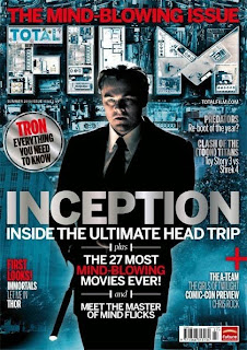
mainstream film magazine evidently shows that it has been made with better technology compared to a independent film magazine. The reason is that they can afford it unlike a independent film magazine maker. Furthermore The background uses de saturated colours such as blue which is also a cold colour. The reason they use a cold colour pallet because the movie is suppose to set a cold, mysterious atmosphere for the audience, in addition it easily watches the target audience eyes out. In addition they have buildings in he background which relates to the film because they are part of one the scenes, second of all it makes it more interesting and exciting rather then having  plain de saturated blue background. The fore ground is showing one of the characters in a suit holding a rifle.
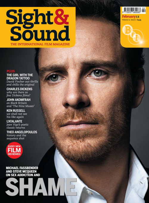
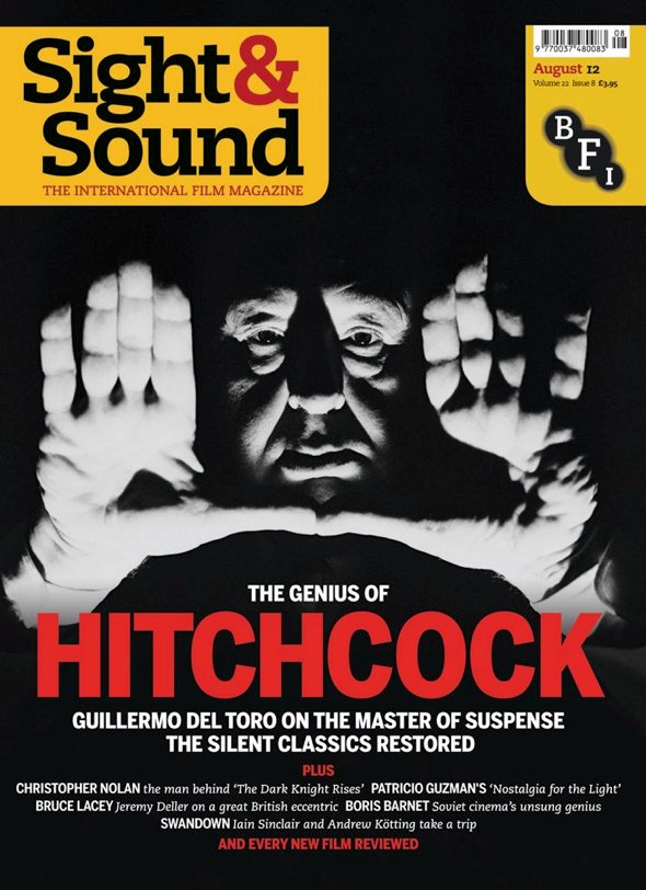
BFI Sight and Sound is an 
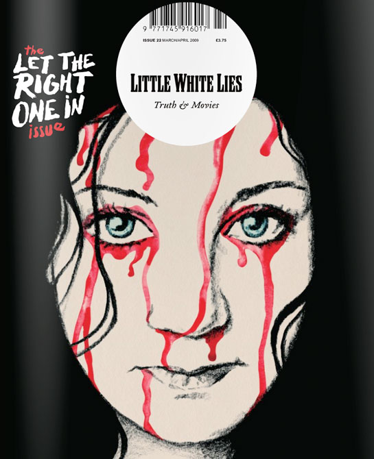
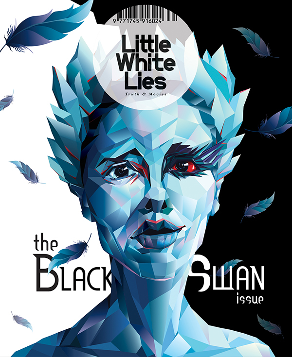
independent film magazine that is presenting individuals called Ewan Mcgregor and Hitchcock. The magazine shows that is hasn't got the luxurious amount of technology. For example the  background colour has no special effects like total film, the Ewan Mcgregor magazine has a gradient silver/white colour. The magazine didn't use the same skills for the background for example using a location of a scene as part of the background like what Inception did or making the background intriguing like the hunger games feature. This does make it less attractive because with the background like Inceptions' it makes it stand out more. But with the BFI Sight and Sound magazine background it could force the magazine to blend in with other magazines or just be ignored completely by audiences. A foreground shows a man called Ewan Mcgregor however it doesn't really look impressive compare to the 'Total Film Magazine'. The BFI Sight and Sound makes the image look like that the designer just took a picture of the individual than just stuck it on the front of the magazine. Their are no special effects to the character to give him an edgy appearance like the Inception character being presented. However Little White Lies tend to have an artistic background for the magazine for the 'Road issue' one has made the colours more artistic. This does make the magazine more intriguing and eye catching. The foreground shows the main people faturing in the magazine with an artistic look such as Natalie Portman from the Black Swan is cover with artistic colours that cover the whole of her face.

Font: 
Total Film magazine has more of a graphical title that increases the aesthetics of the magazine by making it more appealing and unique in a positive way. They use a font on the masthead to make it more bold and attractive as well as using a bird eye view of buildings in heir masthead to make it relate more the movie and blend with the magazine. They also put the first part of the masthead 'total' in the first letter of the second part. For their sell lines they use more of a geeky font probably because the target audience also consist of people who would be considered geeks/nerds.
BFI Sight and Sound masthead compared to Total film looks average. It's bold and black which may catch the eyes of their target audience but it looks boring due to no special effects like 'Total Film' Probably because of the restriction of technology they have. Once again it's probably because of their budget, not being able to get high technology/computer software as well as high standard skill people to manufacture the magazine. The magazine does have sell lines but not ones that relate to other movies like Inception. But they use a basic font for the sell lines with a different font for the sub headings that seem similar to the ones on Adobe Photoshop. However the magazine Little White Lines tend to have more of an artistic font which is used to support the theme of their from cover.

Sell lines
On mainstream film magazines the sell lines on the front cover makes it look more busy and fills up the space on the cover for example total film spiderman edition has sell lines as well as an advert of posters coming across the magazines. Plus all three of the magazines have puffs covering the left side of the magazine.
Independent film magazines such as BFI Sight and sound have sell lines covering the left side of the page but look boring compared to a mainstream film magazines. In addition the magazines with the independent industries tend to not advertise films in their sell lines like the way total film does, for example BFI Sight and Sound have Charles Dickens and Total film for Inception is featuring the movie called Predators. Little White Lies don't have sell lines, probably because they do not have the right to speak about films or because they want to make their covers more graphical and artistic than placing a bunch of sell lines all over the cover. In addition the sell lines uses serif fonts and are predominately small on the page where as the font size on the mainstream magazines are more big and bold.

Colours
Total film magazine uses a de saturated blue as the background which makes it more appealing and exciting. They also had the technology to establish this. The colour blue is also part of the cold colour pallet which was probably used to represent the tone of this film which is suppose to be cold because of the atmosphere that revolves around this film. They use the colour red for part of the sell lines as well as white which goes well with the background and eachother.
Little White lies use more of a artistic approach to their magazines. But the colours that feature on the magazines I find are either cold colours such as blue, purple and that is the one for the 'Black Swan'. The reason they may of use those colours is to give the audience a cold tone due to the cold atmosphere revolving around this movie. Just like the one with the quote' Road issue'. The other Little White lies magazine is using the colour black which is probably to give a dark atmosphere amongst the magazine. The other independent film magazines such as BFI Sight and Sound tend to use basic colours. Probably because of the restriction they have to technology that mainstream film magazines have no problem getting. The magazines look like that they have been manufactured on computer software such as Adobe Phtotshop due to gradient background that one the magazines use and the lack of special effects that the magazine have.