

Image:
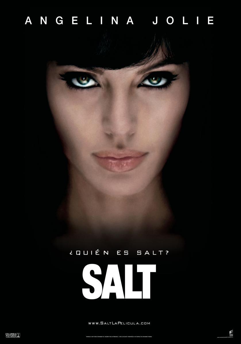
The common convention with Psychological Thrillers is to have the main protagonist in a close up shot which you can see is done with the two mainstream posters. 'Salt' and 'Stoker' both have the stars of the film staring directly in to the camera, this gives the audience a feeling of ambiguity and unknown. This helps the theme of the movies, However with the independent films 'Game' and 'The Unbidden' have the same effect which the eyes staring directly into the audience breaking the forth wall, but they do that in a unconventional way. For example 'The Unbidden' does the same effect but through a blurred wallpaper and 'Game' has three shadowed figures with weapons in there hands. This is done because independent films usually do focus on the narrative more then mainstream films do and with this added to the poster we can figure out what the film is about.
Layout:
I have noticed that a lot of psychological thrillers include the title at the bottom of the poster. The poster usually attempts to place its most famous cast members on the cover of the poster most of the time just above the title. This could be due to the characters mental health or the dangerous situation forced upon him. There is normally little content revealed in a psychological thriller poster as the genre revolves around enigma and mystery. Another key feature included in the poster is a small and brief tag line that adds to the mystery, 'Who is Salt.' is a perfect example of this and the fact it is written in small text adds to the suspense of the film asking the viewer many questions about the film.
Font:
They typically would use a bold text that is clear and easy to read for a psychological thriller film. Salt the and Stoker both have a bold thick font with the name of the film being positioned underneath the picture of protagonist. This is to attract the audiences attention and does give it a professional high standard look. However, the Game is slanted in bold colours but an unknown font and the unbidden is in a skinny writing to give the effect that it was written in blood and with someones finger. Both are different but are equally effective and go with the genre.
Colour:
Both magazines used unsaturated colours for the poster the saturated colours that they did use made certain parts stand out. The colours predominantly used in Posters are white, black and red. They have connotations of violence, blood and danger. A colour scheme that all posters seem to have. Other then Stoker who defines the norm and uses green a saturated colour to bring across there message.
Sell Lines;
A sell line is mainly a phase that is repeated or relates to a film. Usually the conventions of sell lines come in the corner or underneath the title of the film. However in this case Salt and Game the mainstream and independent film went for the same common styles of this genre and Stoker went for the unconventional decision of putting it on the forehead of the protagonist making it clear and concise for the audience to see. Where as The Unbidden went for the choice of not having any sell lines.
No comments:
Post a Comment