Wednesday, 28 January 2015

Updated: Order of Filming

Order of filming:


Drama Studio:
  • . Tracking shot with large depth of field, background everything is quite soft focus - shapes and lights that aren’t recognisable - e.g. brown test tube rack, bottles and liquid
  • 5d. same shot, pulling focus as filming a few times
  • 5c. same shot but reverse - background is in focus and foreground is soft
  • 5b. same shot but changing focus so background is soft focus and foreground is sharp.  (Wheely chair)
  • 16.  Wide shot of commotion - men in w
  • 5ahite coats, a struggle, shaking (few seconds), play with focus


  • 6. Two shot (mid) of men in white coats, laughing - passing a scalpel between them
  • 10.  Close up of hand on moving drill (drill sounds) (men in white coats)
  • 8. Tilt up on fizzing test tube
  • 15. Tilt/ Close up of blood on the floor


  • 12. Close-up of bead of sweat on forehead trickling into eye (don’t reveal face)
  • 17a. Tilt down to tattoo on his neck
  • 17b. Zoom in on tattoo of his neck so just the shape is evident
  • 7. Close-up of foot shaking
  • 9. Pan - right to left (left-right) from elbow to finger as it twitches suspended off the bed

Bedroom Scene:
 
  • 1. Tracking, Wide Shot of Joshua in bed approaching the bed
  • 2a. Birds Eye view of Joshua sleeping in bed (a)one still
  • 3. Wide shot, tracking closer towards the bed from the other side
  • 2b. the same slight and b) one with a slight move i
  • 4a. Birds eye view closer towards the bed  -  a wide shot with a move in
4b. mid shot
4c. close-up
4d. extreme close up
4e. Zoom into eye
  • 7. Close-up of foot shaking
  • 9. Pan - right to left (left-right) from elbow to finger as it twitches suspended off the bed
  • 11. Close up of laying down in bed
  • 12. Close-up of bead of sweat on forehead trickling into eye (don’t reveal face)


Bathroom Scene:
  • 18. Close-up on reflection of tattoo in mirror, zoom out to reveal adult Joshua in mirror gripping basin in mid shot as he hits the basin
  • 19. Mid shot from side on of him looking in the mirror, also he hits the basin
  • 20. C-U of him hitting the basin from side-on
  • 21. POV of his hand hitting the basin
  • 22. OSS shot of him staring intently at the mirror
  • 22b. (OR) OSS of him hitting the basin and  turning and walking away.
  • 23. Extreme close up of eye
  • END  


Order of filming:

Order of filming:


Drama Studio:


  • 5a. Tracking shot with large depth of field, background everything is quite soft focus - shapes and lights that aren’t recognisable - e.g. brown test tube rack, bottles and liquid
  • 5d. same shot, pulling focus as filming a few times
  • 5c. same shot but reverse - background is in focus and foreground is soft
  • 5b. same shot but changing focus so background is soft focus and foreground is sharp.  (Wheely chair)
  • 10.  Close up of hand on moving drill (drill sounds) (men in white coats)
  • 6. Two shot (mid) of men in white coats, laughing - passing a scalpel between them
  • 12. Close-up of bead of sweat on forehead trickling into eye (don’t reveal face)
  • 8. Tilt up on fizzing test tube
  • 16.  Wide shot of commotion - men in white coats, a struggle, shaking (few seconds), play with focus
  • 15. Tilt/ Close up of blood on the floor
  • 17a. Tilt down to tattoo on his neck
  • 17b. Zoom in on tattoo of his neck so just the shape is evident


Bedroom Scene:
 
  • 1. Tracking, Wide Shot of Joshua in bed approaching the bed
  • 2a. Birds Eye view of Joshua sleeping in bed (a)one still
  • 3. Wide shot, tracking closer towards the bed from the other side
  • 2b. the same slight and b) one with a slight move i
  • 4a. Birds eye view closer towards the bed  -  a wide shot with a move in
4b. mid shot
4c. close-up
4d. extreme close up
4e. Zoom into eye
  • 7. Close-up of foot shaking
  • 9. Pan - right to left (left-right) from elbow to finger as it twitches suspended off the bed
  • 11. Close up of laying down in bed
  • 12. Close-up of bead of sweat on forehead trickling into eye (don’t reveal face)


Bathroom Scene:
  • 18. Close-up on reflection of tattoo in mirror, zoom out to reveal adult Joshua in mirror gripping basin in mid shot as he hits the basin
  • 19. Mid shot from side on of him looking in the mirror, also he hits the basin
  • 20. C-U of him hitting the basin from side-on
  • 21. POV of his hand hitting the basin
  • 22. OSS shot of him staring intently at the mirror
  • 22b. (OR) OSS of him hitting the basin and  turning and walking away.
  • 23. Extreme close up of eye
  • END  


Tuesday, 27 January 2015

Production Schedule: Updated Shot Lists


Production Schedule
SHOOTING SCHEDULE – 22nd January 2015


Camera Shots:

-          1. Tracking, Wide Shot of Joshua in bed approaching the bed
-          2a. Birds Eye view of Joshua sleeping in bed (a)one still
2b. the same slight and b) one with a slight move in)
-          3. Wide shot, tracking closer towards the bed from the other side
-          4a. Birds eye view closer towards the bed  -  a wide shot with a move in
4b. mid shot
4c. close-up
4d. extreme close up
4e. Zoom into eye
-          5a. Tracking shot with large depth of field, background everything is quite soft focus - shapes and lights that aren’t recognisable - e.g. brown test tube rack, bottles and liquids
5b. same shot but changing focus so background is soft focus and foreground is sharp.  (Wheely chair)
5c. same shot but reverse - background is in focus and foreground is soft
5d. same shot, pulling focus as filming a few times
-          6. Two shot (mid) of men in white coats, laughing - passing a scalpel between them
-          7. Close-up of foot shaking
-          8. Tilt up on fizzing test tube
-          9. Pan - right to left (left-right) from elbow to finger as it twitches suspended off the bed
-          10. Close up of hand on moving drill (drill sounds) (men in white coats)
-          11. Close up of laying down in bed
-          12. Close-up of bead of sweat on forehead trickling into eye (don’t reveal face)
-          13. Close up of bloody knife being put down on the tray (hand-held/pan across to follow the arm as it places the knife on the tray)
-          14. Mid-close-up shot side view of- Joshua’s chest moving  up and down (breathing sounds in background)
-          15. Tilt/ Close up of blood on the floor
-          16.  Wide shot of commotion - men in white coats, a struggle, shaking (few seconds), play with focus
-          17a. Tilt down to tattoo on his neck
-          17b. Zoom in on tattoo of his neck so just the shape is evident
-          18. Close-up on reflection of tattoo in mirror, zoom out to reveal adult Joshua in mirror gripping basin in mid shot as he hits the basin
-          19. Mid shot from side on of him looking in the mirror, also he hits the basin
-          20. C-U of him hitting the basin from side-on
-          21. POV of his hand hitting the basin
-          22. OSS shot of him staring intently at the mirror
-          22b. OSS of him hitting the basin and  turning and walking away.
-          23. Extreme close up of eye
-          END 


Wednesday, 14 January 2015

Magazine font experiments


I will be testing the majority of serif fonts because my magazine cover will be an independent magazine so the sell lines, mastheads and other text will be predominately serif.


Potential fonts for the masthead and sell lines of magazine front cover.


Monday, 12 January 2015

Convention of film poster


Colours
The colours used were black, white and red. The black used on her dress is to represent the black swan. While she is wearing the dress a red hand is shown, the colour red represents danger, blood, and other things associated with those words. This revolves around the black swan because the black swan was dangerous messing with her brain, ending up with her stabbing herself and the red hand can represent that because in the film that hand was probably the hand she used to stab herself with. The white background can represent the white swan, the colour white is the dominant colour on the poster and probably is because the white swan was the innocent one out of the swans. Innoncence as a force was dominant due to the fact that people always so the girl who was taking on the role as both of the swans as innocent and when she tried to make her personality fit with the black swan, it was messing her up psychologically so she wanted to be innoncent like the white swan again. Furthermore the black and the white on the poster can contrast each other, the white representing the light side and the black representing the darkish. The text on the on the poster is white so it will be able to be seen on the poster due to being right on the black swan.

Image
The image being shown is Natalie Portman character in the form of the black swan surrounded by black feathers in the air. This automatically represents the black swan in the film plus the body movement of the girl shows how this girl being the black swan makes her less innocent plus her facial expressions makes her look like she's going to be a problem within the film. 

Font
The title' Black Swan' is big so the customer or person reading it can easily see it plus it's in white for a reason because it's placed on the black part of the poster and being their in white will be easier for the audience to see because if it's black then it will blend in with the black dress. In addition the title is one of the main conventions on the poster so it has to be easy to read and noticeable for the reader. The names of the main actors on the poster is placed on top of the title, the font size is still big enough to read but it has a different colour. The colours is much darker compared to the title but still noticeable. The reason could be because the poster may want the reader to see the title first then the actors/actresses featuring in the movie. Plus the names were around the main title of the film so making the names of the actors/actresses would make style of the poster unorganised. The text right at the bottom is small, the reason for this is because they didn't want it to take up to much space because it really wasn't that important like the main title. 

Layout
The layout of the poster is most of the text at the bottom area of the poster which gives the poster an organised, tidy look, the text at the vary bottom is small with the title in the middle of the poster and it has the biggest font size and the names of the actors/actresses are a bit smaller but at the top of the title. The image of the main character which is the girl in the form of the black swan is all over the poster with the feathers thrown in the air. 


Saturday, 3 January 2015

film magazine poster

Font
This is a poster so people will be more focused on the image that the poster is showing so they are using the image of the main characters tattoo which represents the title of the poster. Furthermore the size of the font that is being used is from medium to small so I should take this into account of these conventions and factors when constructing our poster.

Images
The images used on the film poster is big because it needs to attract the audience easily and due to the fact  that it is a post people wouldn't really focus on the text. They would want to see the image on the poster. The image of the tattoo was used as the hermeneutic code in the red dragon trailer so I should do this to link the trailer and the poster together like the way they did here and it makes the poster more intriguing due to the fact that people don't have a full understanding on the tattoo yet.

Colours
The colours being used are red, black and white. The red relates to the title 'red dragon' and the other colours fit well with red so they use it for their poster. In addition black goes with the tattoo so they may be just using these colours because goes well with their movie 'red dragon'. In addition they use three colours rather 5 which helps the poster formulate an organised house style.

Layout
The film poster has an organised house style which helps the aesthetics of the film poster. However there are no credits at the bottom and many posters do have credits maybe this is the way of making a counter hegemony and making the film poster look unique by removing one convention that is predominately used. I should take this into account and do this with our poster. The production logo is at the bottom right corner which should be taken into account and be done on our poster. It's a way of informing the audience that this production company made this film.


Friday, 2 January 2015

Draft Two: Magazine

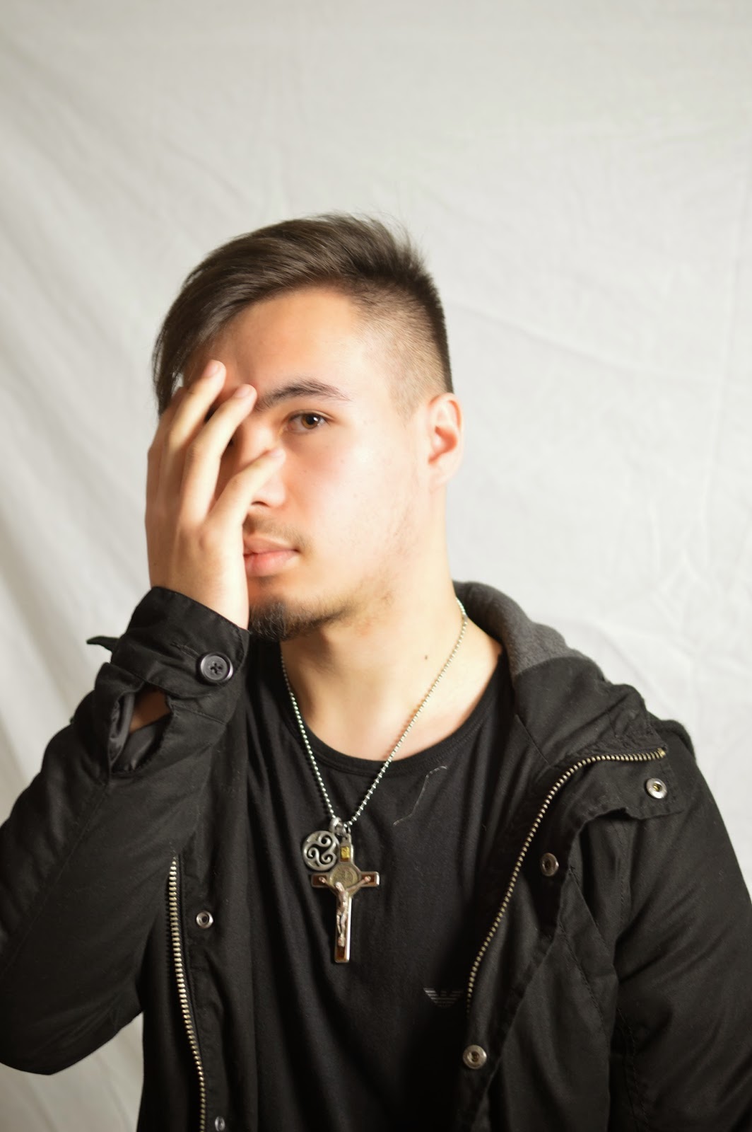
I looked through a number of images of our main protagonist and most of the pictures didn't suit the feel of the movie that I was going for. However, this photograph of our protagonist looked angry and dis pleasured really anchored the narrative of our film.   I then cropped and added the image myself and placed it into my magazine, I took out the background because I thought it would look better if I created my own background to match the genre. 

Tuesday, 30 December 2014

Magazine Sketches

Following the conventions of a film poster, I looked at the conventions of the poster titles, taglines and image to begin the layout. Below is a few images of examples of layout
I have an idea for. After getting feedback on the magazine  and seeing that the previous ones Were quite mainstream, I made a new sketches mimicking a more independent Magazine.  The image remained in the middle and the name of the film but I removed all
sell lines the only convention I did follow was the bar code being on the magazine but I  made it un - conventional by putting it horizontal.  I’m going to put the names of the directors and actors on the bottom. The background I’m going to use matches what I used in the trailer.

Wednesday, 17 December 2014

Mood Board Magazine

I made a mood board full of independent magazines to give me inspiration about making  my own magazines. I used the ides of smaller fonts on the sell lines and the larger masthead.  It keeping everything I used minimalist and a to smaller standard.   All the magazines are unique and different which gave me the freedom to make daring decisions when coming to the magazine. 

Tuesday, 16 December 2014

Title Development

Title Name
After a brief discussion of names for our film, we needed a title to relate towards our film. With a look over the plot we came up with choices as a working title for now.

The look
We discussed how we would like to picture our title coming in. We don't want a plain text that enters or has a flashy entry with beaming lights or such. We want our title to have a build up, dark, and build tension by its own devices.
After searching around for a template for us to be inspired from, We like the idea of having our title launch out towards the audience letter by letter, however during testing I had the problem of getting the individual letters come forward instead having the whole text would. I came across a video that teaches how to make a text with the individual letters come forward which helped our progression and taught an advance way to make the title in a 3D camera view.

Production Logo

Logo
Like other examples from a previous post where we collected what other companies logos are, we gathered that the majority has a simplified drawing of their name. For example Blackwood Pictures has the image of a forest, or another example is Summit Entertainment has these curves that symbolises a summit. Other companies do have another similar design such as triangular shapes to form their logo, examples being The Weinstein Company and Spectrevision. Since are name consist of objects we could go along the lines of having our title simple and a image relating towards our name.

Fonts
After looking at other comparisons we saw that most lean towards a serif font with everything in capital letters. This can go for a more stylish look, while highlighting the name thus grasping attention in a smooth way. Other examples like Spectrevision use a sans-serif font which is bold and stands out. The font size is smaller than the logo, however the because of its bold appearance it still makes itself present. 

Brainstorm company logo name
After a selection of different ideas to name ourselves we needed it to all agree with it but most importantly if it will stay with the audience. After  reading a selection of the names we came up with Crystal Peak Production was soon the creation to be made with the majority of our class agreeing and after researching other company names we realised ours does come to a similar theme and we all feel it’s a name that is memorable.

Test
We wanted our logo to have the text appear letter after letter and then the design that would establish ourselves transits itself in.


Thursday, 11 December 2014

Magazine front cover images from photoshoot


 These are the images for the magazine cover, we used dark clothes for his costume because he's suppose to have a dark atmosphere around him due to the fact that the teaser trailer represents him a dark way.
We used medium closes up to get his full costume and to see his facial expressions properly. We also wanted him to engage with the audience with his eyes while his image is on the front cover.

If I want to remove the background from the photo and just have him for them magazine i can just use lasso tool on photoshop.


Existing Teaser Screen Grabs


This image is from a horror film 'I know what you did last summer too'. We thought that this image would relate to our movie trailer because firstly this camera shot is very powerful. It's an over head shot (when the character is laying down) where the main protagonist is looking directly at the audience 'breaking the fourth wall' and letting us see or listen to there story.  We thought that this shot will would be very useful
in our trailer.


This is another image from official trailer of  'Sinister'. In this trailer they kept on going back to symbols which relate and are an important part of the narrative in the movie. In our film our protagonist has a symbol on his arm and that is a key part of information, so through out our thriller trailer we two will keep cross cutting images of symbols.


Where going to be playing with lighting in our trailer. There is going to be a lot of darkness which key bits of spot lights when needed. This long shot taken from 'Black Swan' is the type of shot that we are going to take of our protagonist. We like the idea of the lights only being on him highlighting his importance.

Wednesday, 10 December 2014

Screen grabs from existing teaser trailers


All the trailers here are from Hannibal Rising, Hannibal, Red Dragon and Shutter Island                                                          

These are screen grabs from Red Dragon and Hannibal Rising. The title that says Red Dragon the trailer i like because it blends in with the background well. I also liked the tattoo they showed on the back which is a hermeneutic code because the trailer doesn't explain the meaning of the tattoo or it's purpose so my group and I can take this into account and use it in our trailer. Furthermore I like the close ups of Hannibal Lecter in Hannibal Rising where the blood is on his face because this use of cinematography clearly shows the expressions of his face which gives the audience an idea of this character or their personality which can show that he's crazy or just psychologically unstable. I like the use of the titles on Hannibal Rising trailer due to the way it creates an effect with the eye.

The use of the focus pull in the science laboratory in Hannibal Rising I liked because at that moment of the trailer someone was trapped and drowning in water so the use of the focus pull makes it seem like that he's losing life and slowly dying and his eye sight is becoming less clearer which is what the focus pull is suppose to represent.
I like the close up of Hannibal Rising while he's holding his weapon because it gives an insight of what is going to happen in this scene due to the weapon representing violence and danger.

I can apply this information that I've researched and use it in our trailer by using a hermeneutic code in the teaser trailer which limits information and makes the movie more intriguing. Furthermore we should use cinematography like focus pull to blur out the scene to make it more mysterious like the Hannibal Rising's scene. Close ups should be used in the trailer to show the clear facial expressions of the character being presented which will contribute to the atmosphere of the movie.
With the trailer titles which is a convention for trailers we must be able to use them effectively and support the trailer.


Friday, 5 December 2014

Locations for filming

 These are potential locations for the filming because we need a bathroom with a mirror due to the fact that at the end of the teaser trailer he will be looking into the mirror starring at his tattoo.
Furthermore it has great lightning within the scene because if the room is too dark then the lightning within the recording wouldn't be clear and just too dark which makes it to harder towatch.
This is another potential mise en scene locations because it     has a bed and we have easy access to this location.

Thursday, 4 December 2014

Magazine sketch 4

With this sketch I decided to do a layout that is influenced by little white lies, so I left out sell lines and put a masthead and barcode. With this I only focus on the aesthetics of the product.
The only thing is that is different that I placed a triangle in the middle of the circle, I did this to make my version have an unique element.

Sounds research


 During the process of constructing the animated storyline, I did extra research for sounds and the reason is because I want to have clear, distinctive sounds that can co-operate with the storyline and help the scenes be more clearer. For example if a glass is meant to drop then the sound can automatically indicate that the glass dropped or with one of our scenes, the main actor is sleeping so I would use the snoring sound to indicate this happening.

Furthermore using sounds will have a high possibility of helping my group and I on using sounds during the trailer so it will be also preparing us before filming the trailer.


Sounds that I have, used: Drill, snoring, and glass shattering.

Magazine sketch 3

With this sketch all I did was chage the layout of the house style so the sell lines will be equally balanced on both left side and the right side. 

Magazine sketch 2

With this idea I changed the layout of the house style for example sell lines. I placed it at the bottom of the magazine.

I used this magazine from sight & sound to influence this design so I placed the sell lines at the bottom just like this magazine and made the image bigger. I also placed a white outline on the edges of the magazine just like sight out sound. I placed my small phrase at the top of the magazine.


Magazine front cover sketch


Wednesday, 3 December 2014

Film poster sketch 2

With this sketch I didn't include the credits to see how it looks. I added all the dashes at the top which is suppose to be the actors/actress names. I included the tattoo in this which is a hermeneutic code, this will help link the poster and the trailer together. This poster is influenced by the red dragon poster.

nnn

Tuesday, 2 December 2014

Storyboard Part 3


Storyboard part 2


Difference between trailer and teaser

Trailer and teasers are both used to build a hype around the movie and to make it more intriguing for the target audience. However there are significant differences between a trailer or teaser.

Trailers are normally around 2 minutes with a variety of difference scenes and dialogue amongst a variety of different characters where as teasers are 1 minute long and show a short length of sneak previews in the teaser. While examining a teaser and trailer the trailer gives more detail on the narrative to the target audience about the storyline or gives the audience a clear understanding of the structure of the storyline where as the teaser doesn't relevantly need to, it just has to show short length sneak peaks of scenes to build a hype around the movie. The teaser still may give brief clues on the storyline and a teaser may still be just about longer than 1 minute but are definitely under 2 minutes. They may also have dialogue as well.

Cinematography
Teasers would use medium close ups or extreme close ups to show the emotions on a characters face while doing a quick shot of the character to create an atmosphere that could build up more of a hype around the movie. Trailers would also use medium closes up but they would use edits as well as such as shot reverse shot to show glimpse of dialogue between characters. Teasers use low shots as well to create this tension within the atmopshere such as the teaser for Hannibal Rising.