Showing posts with label Research and Planning. Show all posts

Wednesday, 4 February 2015

Prop and Costume.

With sociological thriller films, all the characters used in the film have typically normal clothing and even though our character is the main protagonist we want the audience to know that he is just 'normal'. So we wanted to dress him in that fashion. This is also what makes sociological thrillers so scary and effective because the main characters usually look exactly like everyday people, so it makes the audience put themselves in the protagonists shoes and wonder if that could happen to them.
We have chosen jeans and a black shirt nothing that stands out to much.  That will connote to the audience that he doesn't want to stand out of the crowd, he has nothing that attracts to much attention he wants to blend in. This is a very conventional outfit for a young teenage boy/young adult it also helps the audience relate to him more because he dresses like anyone would.

Thursday, 11 December 2014

Existing Teaser Screen Grabs


This image is from a horror film 'I know what you did last summer too'. We thought that this image would relate to our movie trailer because firstly this camera shot is very powerful. It's an over head shot (when the character is laying down) where the main protagonist is looking directly at the audience 'breaking the fourth wall' and letting us see or listen to there story.  We thought that this shot will would be very useful
in our trailer.


This is another image from official trailer of  'Sinister'. In this trailer they kept on going back to symbols which relate and are an important part of the narrative in the movie. In our film our protagonist has a symbol on his arm and that is a key part of information, so through out our thriller trailer we two will keep cross cutting images of symbols.


Where going to be playing with lighting in our trailer. There is going to be a lot of darkness which key bits of spot lights when needed. This long shot taken from 'Black Swan' is the type of shot that we are going to take of our protagonist. We like the idea of the lights only being on him highlighting his importance.

Wednesday, 10 December 2014

Screen grabs from existing teaser trailers


All the trailers here are from Hannibal Rising, Hannibal, Red Dragon and Shutter Island                                                          

These are screen grabs from Red Dragon and Hannibal Rising. The title that says Red Dragon the trailer i like because it blends in with the background well. I also liked the tattoo they showed on the back which is a hermeneutic code because the trailer doesn't explain the meaning of the tattoo or it's purpose so my group and I can take this into account and use it in our trailer. Furthermore I like the close ups of Hannibal Lecter in Hannibal Rising where the blood is on his face because this use of cinematography clearly shows the expressions of his face which gives the audience an idea of this character or their personality which can show that he's crazy or just psychologically unstable. I like the use of the titles on Hannibal Rising trailer due to the way it creates an effect with the eye.

The use of the focus pull in the science laboratory in Hannibal Rising I liked because at that moment of the trailer someone was trapped and drowning in water so the use of the focus pull makes it seem like that he's losing life and slowly dying and his eye sight is becoming less clearer which is what the focus pull is suppose to represent.
I like the close up of Hannibal Rising while he's holding his weapon because it gives an insight of what is going to happen in this scene due to the weapon representing violence and danger.

I can apply this information that I've researched and use it in our trailer by using a hermeneutic code in the teaser trailer which limits information and makes the movie more intriguing. Furthermore we should use cinematography like focus pull to blur out the scene to make it more mysterious like the Hannibal Rising's scene. Close ups should be used in the trailer to show the clear facial expressions of the character being presented which will contribute to the atmosphere of the movie.
With the trailer titles which is a convention for trailers we must be able to use them effectively and support the trailer.


Friday, 5 December 2014

Locations for filming

 These are potential locations for the filming because we need a bathroom with a mirror due to the fact that at the end of the teaser trailer he will be looking into the mirror starring at his tattoo.
Furthermore it has great lightning within the scene because if the room is too dark then the lightning within the recording wouldn't be clear and just too dark which makes it to harder towatch.
This is another potential mise en scene locations because it     has a bed and we have easy access to this location.

Thursday, 4 December 2014

Sounds research


 During the process of constructing the animated storyline, I did extra research for sounds and the reason is because I want to have clear, distinctive sounds that can co-operate with the storyline and help the scenes be more clearer. For example if a glass is meant to drop then the sound can automatically indicate that the glass dropped or with one of our scenes, the main actor is sleeping so I would use the snoring sound to indicate this happening.

Furthermore using sounds will have a high possibility of helping my group and I on using sounds during the trailer so it will be also preparing us before filming the trailer.


Sounds that I have, used: Drill, snoring, and glass shattering.

Tuesday, 2 December 2014

Storyboard Part 3


Storyboard part 2


Difference between trailer and teaser

Trailer and teasers are both used to build a hype around the movie and to make it more intriguing for the target audience. However there are significant differences between a trailer or teaser.

Trailers are normally around 2 minutes with a variety of difference scenes and dialogue amongst a variety of different characters where as teasers are 1 minute long and show a short length of sneak previews in the teaser. While examining a teaser and trailer the trailer gives more detail on the narrative to the target audience about the storyline or gives the audience a clear understanding of the structure of the storyline where as the teaser doesn't relevantly need to, it just has to show short length sneak peaks of scenes to build a hype around the movie. The teaser still may give brief clues on the storyline and a teaser may still be just about longer than 1 minute but are definitely under 2 minutes. They may also have dialogue as well.

Cinematography
Teasers would use medium close ups or extreme close ups to show the emotions on a characters face while doing a quick shot of the character to create an atmosphere that could build up more of a hype around the movie. Trailers would also use medium closes up but they would use edits as well as such as shot reverse shot to show glimpse of dialogue between characters. Teasers use low shots as well to create this tension within the atmopshere such as the teaser for Hannibal Rising.


Fonts Ideas/ Logo and Picture Ideas


Our name is crystal peak productions, so I think that it would be interesting if we associated the picture of a crystal and mountain peaks in our company pictures. I like the black background because you would be able to see the pictures of the crystals more defined. I also think a black back ground will look more professional and as if this is a real production company.  This simple design wouldn't attract too much attention if it was on other platforms for example: magazines or posters it would allow the other images to still be seen.


I came across quite a few fonts  and they all had the same
thing in common they all where clear and easy to read.
They where also all sans serif,I think its important to have a cleat font so that you can real it straight away which saves any confusion for the audience and the name for our film is called FACE so that needs to be bold and memorable when you see to have an big have an impact.


Story board one


Monday, 24 November 2014

Film Trailer Analysis: Black Swan


Black Swan is the psychological thriller movie I have chosen to analysis. It came out in 2010 and it develops and challenges the conventions of the stereotypical thriller movie.

The first shot we see is a long shot of a ballerina dancing gracefully across the dance floor, she is dressed in white communicating pure and innocence to the audience. All that is is on her is a single strobe like from above. The atmosphere of the movie is confused at the moment because the audience doesn't know what to expect. However, the audience would get a feeling that the trailer is going to take a turn for the worse, in the voice over we her the ballerina say “I had the craziest dream last night. About a girl who was turned into a swan, but her prince falls for the wrong girl, then she kills herself.” 
This is an strange statement to make because audience don't put the words etc kill, love and prince in the same sentence. Those words are makes it a more thriller genre.

We then meet the character of Nina. We have a wide shot of a dance studio and we she the adult ballerina stretching out her feet and dancing we quickly discover that she is the main protagonist and that there is an heavy theme of dance that is going to be used through out the film. Halfway in to the trailer is where things begin to get dark and more into the thriller genre as before that we where just getting hints of thriller but around 52 seconds into the film is where things begin to start happening.

We start to have some close up of Lily dancing and this of Nina's face looking distressed telling the audience that there will be some rivalry between them. Mirrors where used a lot in this trailer the use of the mirrors where very effective because towards the end of the trailer the mirrors are smashed and is associated with Nina and her changing character However, the mirror was also used to broadcast the dancers beauty and almost as an envy to the other dances. The mirror has two meanings in this trailer it is the equilibrium and disequilibrium.

Towards the end of the trailer we begin to see a series of fast paced editing, montage shots, and an repeating non diegetic voice over of key words. 'Sweet Girl' and 'Please believe me'. This makes the audiences feel on edge where not aware of what is going to happen yet still wanting more. We are then showed an shocking image the final shots of Nina are truly horrifying we she her a long shot shows her blood shot eyes, blood red lips and pale skin and her black costume. This shows the audiences the transformation she went from good to bad, she is no longer the innocent ballerina in the beginning we almost saw her journey to the dark side.

Levi Strauss - Binary Opposition

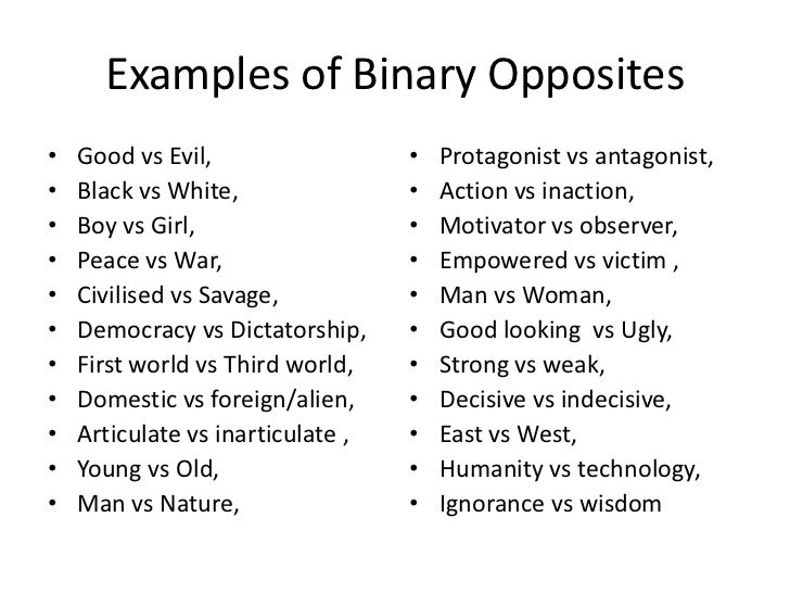
Levi Strauss is an anthropologist who invented a theory called the Binary Opposition. The Binary opposition is where 2 opposites battles with each other such as good vs evil. The theory Binary Opposition is used by directors of movies a lot to create a storyline with in the movie for example in Dark Knight there was the hero which was the Batman and the Joker who was the villian. Furthermore in the perspective of a psychological thriller movie the binary opposition could be 'mind vs body' which like the psychological thriller movie Silence of the lamb which is illustrated this binary opposition with the antagonist thinking and believing he is a woman so he battles his body to force this female appearance and gets rid of the male appearance.

Levi Strauss's theory (Binary Opposition) can easily relate to our movie due to the fact that oppositons will be battling each other for example it's mind vs body, good vs evil, past vs future and Decisive vs indecisive.                                        

I agree with the fact that every movie or tv dramas consists with a binary opposite  such as downtown abbey is rich vs poor. In some films the binary opposition is not always easy to pick out due to the complexity of the narrative within the film.

Monday, 17 November 2014

Poster/Magazine/Website Case Study: Interstellar

                      interstellar-empire-cover-newsstand

Poster
Interstellar is a mainstream Sci-fi Thriller with psychology thriller traits. The protagonist is centrally framed and wears a space suit which seems to be the iconic look towards the movie. The backdrop is a snow plains which  seems to be the main iconic location of the movie. The colours are mainly white or a saturated blue colour palette to compliment the location and give the explorer mysterious feel. Further the colour can connote peace, mystery, and a beginning which all ties in within the movie. The title is serif to stylishly stand out and is present with half the title white and the other black as monochrome, which is binary opposition. This could signify a dark side within the movie. The director, production company, etc are placed underneath the title which most film posters do. The statement about the movie being theaters and IMAX are in bold to alert the audience and  underneath states the date with a bigger font size. The actors names are place above with the second name bold in black against the white background.

Magazine cover
Empire is a lead world-wide selling movie magazine that specialises in mainstream movies. The title/masthead has adapted to the films themes by using complimentary colours and a space backdrop within the bold sans-serif text which links towards the film, since its about space. Even the sell-lines has adapted to the house theme of blue and white. At the bottom right corner is a puff that contradicts the colour scheme pattern by being red which is binary opposition making the puff stand out and attracts the audiences attention. The protagonist is centrally framed for star marketing.

Website
The website starts with a transition of the stars and once complete shows there trailer


House Style
The masthead is the same between the poster and website, however not for the magazine due the magazine needing to keep a certain style of their own.


Hannibal rising case study (Psychological thriller movie)


Poster
Hannibal Rising is a psychological thriller movie which is also a mainstream movie. Due to being a mainstream movie they would have no restriction to technology. The post shows the face of Hannibal lecter with his mask on. This relates to movie well because Hannibal Lecter is a cannibal in the movie and the mask he wears is what cannibals wear so it would make sense for the poster to show him wearing this. In addition they only show his red pupil eyes as well as the skin around it which is the only part of his body that is being shown. The colour red is suppose to represent danger, hate, blood. evil so showing his eyes will relate to the tone of the movie because it's showing evil behaviour, dangerous moments, blood and hate from a character. The post has the annual year which it will be released in which is 2007, this will help the audience be informed on when it's being released. The poster also feature a little line which is 'It started wit revenge'. This reflects the character on the poster because his murders started of as revenge acts because of what happened to his family in the war but ended becoming part of his character and his mind adapting this idea of killing people is normal which relates to psychological thrillers. Furthermore the poster uses the colour black as the background to show the audience that this movie has a dark atmosphere to it. The poster shows the company it's affiliated with.

Website
The website of Hannibal Rising shows the main character (Hannibal Lecter) without the mask and has a quote in a big font saying 'the most terrifying chapter in the series of the silence of the lamb'. Hannibal Rising is a psycholigcal thriller with elements from horrror and is part of a series that is known as horror as well so they did it to relate it to the horror fans so they don't lost of their part fans. It can be also be argued that, that line was used to give chills to the audience and make it more appealing to the customers. Hannibal Rising shows a trailer of the movie which will allow the target audience to see what film is about and what it's going to be like plus to make it easier for the audience to watch the trailer and make the website more interesting. They have photos of some violent scenes such as the murder scenes that Hannibal Lecter commits which gives a dark atmosphere between the audience and the movie. In addition gives a preview of what Hannibal was capable of at that young age. The background of the website is black to support the dark atmosphere as well as a gold colour in the middle which blends in with Hannibal's jacket. They are promoting a DVD and book so they can get the target audience to buy it and inform them that it's ready to be bought.
http://www.hannibalrising.com/


House Style:
The font of Hannibal Rising is the same across the websites, posters are the same and the font being used on the trailers are similar. In addition this creates an organised house style because of another trailer or advert pops up with the same font then people would assume that it is Hannibal Rising plus it makes it easier for the audience to identify the film. In addition the colours that mainly affiliate with Hannibal Rising when it comes to trailers, websites and posters is black, gold, red and white. The reason black and gold is used is because of the colours that are used on Hannibal Lecter's clothing which are also black and gold plus the tone of colours that are featuring on the Hannibal Rising poster can easily relate to black and gold. Plus Hannibal Rising is part of the Silence of The Lamb series and the movie 'Hannibal' has the DVD as well as the video cover showing the first version of Hannibal having the colours gold and black revolving around his image which is his older, original version of him. Red is used a lot because the theme of this film is violence, psychopathic killing and that relates to blood which is what red also symbolises blood as well as danger. White was just used for the small quotes within the trailer.


Independent magazine (Annotations)


Font 
The font that is used on the magazine front cover which is BFI sight and sound is serif font, the sell lines on the font are not that big and predominately small. However the main film being featured is big and bold so it can catch the eye of the audience easily. Furthermore the font size on the masthead is big and bold which is also done to catch the eyes of the audience. Furthermore normally on the font size for sell lines are predominately small on the predominate amount of magazines which makes the rule a hegemony which is a concept used by Gramsci so when my group and I come to making our poster we should take the rule of these conventions into account and apply it or make a counter hegemony which means we will challenge it. The volume issue is small but the date on this magazine is medium size, probably because they want the audience to automatically see the date but the issue number is small.

Colour
The magazine front cover uses 4 colours within the colour scheme so it can keep an organised, neat and tidy house style if there was more than four then it can look unorganised. In addition BFI sight and sound magazines use yellow, red and white as their main colour scheme.


Sell lines
The sell lines on this independent magazine featuring on this magazine are independent films because they are featuring these independent films so they can maintain there independent structure and appearance, if they were to feature mainstream movies such as amazing spiderman 2 then it will become more mainstream. Furthermore the sell lines are at the bottom of the magazine, probably because of the image, they want the image to be fully visible and big so they place the sell lines at the bottom so the audience cannot be distracted away from the image. In addition the main sell line which is 'Michael Haneke' is big and supporting the image of the magazine so that sell line has to be big due to it's important role for this magazine volume issue.

House style
This magazine has a organised house style starting with the conventions such as the fonts, they are small and at the bottom of the magazine so that they don't block the main image of the magazine. Plus the use serif fonts. Furthermore the date, issue number, price and barcode are all together which gives an organised house style however barcodes are normally at the bottom of the magazine which then makes this magazine cover seem like that they are challenging the hegemony of an independent magazine house style structure by playing the barcode on the top of the magazine cover.


Thursday, 13 November 2014

Website analysis: Shutter Island


Website analysis

The website starts by playing a trailer on the top right to promote their movie and show multi-media convergence by following to promote their DVD underneath and the synergy of having special content on the DVD. Furthermore there is a Facebook link at the bottom center of the page. Also several social media bottom left.
They use a misty blue around the island which can connote to a mysterious, isolated location to give that sacred haunted feeling. The mist is animated with the lighthouse going round to heighten the effects of the spooky island.
The lead actor is centrally framed with only a face shot and a pulse effect.
The release date below the masthead is red which is a strong colour and draws the audience in. The colour could also signify danger.
The copyright information is in the bottom right.


In our film if we were making a website I think the use of colour would be a good format to include. The deep saturated colours and a red text to highlight and catch the audience’s attention of whatever they really want to promote. Adding some sort of effect would be a good choice and having the main soundtrack on the page would synergise with an album. Furthermore showing the trailer on the website will promote our film even more and would deliver a sense of information on the movie before even clicking on any other subject matters. The only problem I see is that I feel that the actor’s names should at least be more advertised. I know they promote there star market but this could have been a debut for a new star or the co-star.


Wednesday, 12 November 2014

Genre Theorist Analysis - Daniel Chandler

Daniel Chandler
"Conventional theories of genre tend to be based on notion that they constitute particular conventions of content"

The quote that Daniel Chandler is saying is that the conventions within a genre are to be believed that they are the content such as the narrative retentively being the same for each genre. For example within most psychological thrillers the narrative will mostly be the characters battling their own minds attempting to determine what is real, who they are, and what life's purpose is or the characters may be threatened with death, be forced to deal with the deaths of other, or fake their own deaths.

Film examples are:
Black Swan
Shutter Islands
Gothika
The butterfly effect

These films narratives all have a protagonist that has some sort of lost control and is going through a life journey to solve their problem.
With our film narrative we will go along with Daniel Chandler's statement by also containing conventions related towards thriller such as the own narrative being about a protagonist whose mind is not stable also going through a life journey.

David Buckingham Theory

"Genre is not simply given by the culture; rather it is in a constant process of negotiation and and change" 

-David Buckingham 


Psychological Thriller is a sub genre of Thriller. They usually have a 'dissolving sense of reality', and they incorporate elements of mystery, drama, action and horror. Psychological Thriller are based on books and other movies of the Horror genre.


What David Buckingham is saying is that Psychological Thrillers don't exist as an genre. It changes because of the views of society because genre have to stay relevant, if they don't they wont relate to an audience and the audiences take to certain movies. I do agree with this statement because over time the production of Psychological Thriller movies has changed, as the audiences have become more liberal. I think that they are getting away with more narratives.

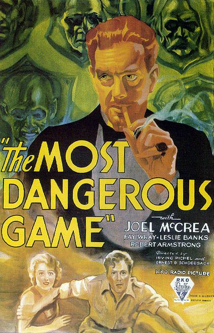
'The Most Dangerous Game' - Directed by Irving Pichel
This movie was released in 1932 in black and white. It was a short film being only 78 minutes long. Keywords to describe it were, madmen, escape, psychopath and slaughter. These are stereotypical conventions of a psychological thriller, however the certificate rating of 12 shoes that only frequent violent scene were shown. Therefore, they were not allowed to empathize on murder scenes. You can see with this movie that the audience would have been shocked to see these type of films on screens. In comparison to what is being done today in present day.


Brimstone and Treacle - Directed by Richard Loncraine

This movie was released in 1982. This movie was made in colour and it received an certificate rating 18, which means that violence was shown, including blood and gore also bad language and sexual scenes such as rape. This shows that the audiences where becoming more used to the idea of 'thriller' and being scared.

Now in present with everything being exposed online, and web 2.0. Audiences are pretty much desensitized when it comes to movies. We also are using more technology and cgi to film something that they didnt have before.


Steve Neale & Henry Jenkins theory

'Genre are instances of  repetition and difference' .
This quote made by Steve Neale means that the accustoms that occur in genres normally repeat itself in every movie within that genre. For example Psychological thriller movies normally consist with characters that have relationship problems, problems with their identity such as the movie 'The Silence of the lamb' with the villain battling his gender identity wanting to see himself being a woman rather than a man. It also consist of characters having an issue with their mental state or having psychological problems such as the movie the ' Black Swan' where the protagonist auditioned for two roles which was the white swan and the black swan. They told her she suited the role for the white swan but not the black swan because her personality didn't fit well with the role so she try to become more like the black swan but ended up messing up her state of mind causing her to mix her imagination with reality.

Psychological thrillers repeat the themes of reality, identity, perception, mind, death, existence/purpose.
The differences within these psychological thriller movies are the narrative. Some movies within this genre have different elements to other genre as well such as Horror, drama, mystery, action or psychological horror. This also gives characters a different tone for example a character within a psychological thriller movie that has elements from a horror drama will have a dark, psychological problem to a character within a psychological thriller with elements from the genre of drama which will give soft dark tone. Plus the mise en scene will be different for instance the narratives within a psychological thriller with elements of drama will consist of more action, tension and problem solving such as Hannibal which the narrative consist of more suspense, detective problem solving and a character being resistant to good nature and the props that will be used will not be as violent as psychological thriller with horror elements. Psychological thriller with horror elements would consist of a psychopathic killer with a dark tone and the props that would be used would be a violent object such as a knife or blood.
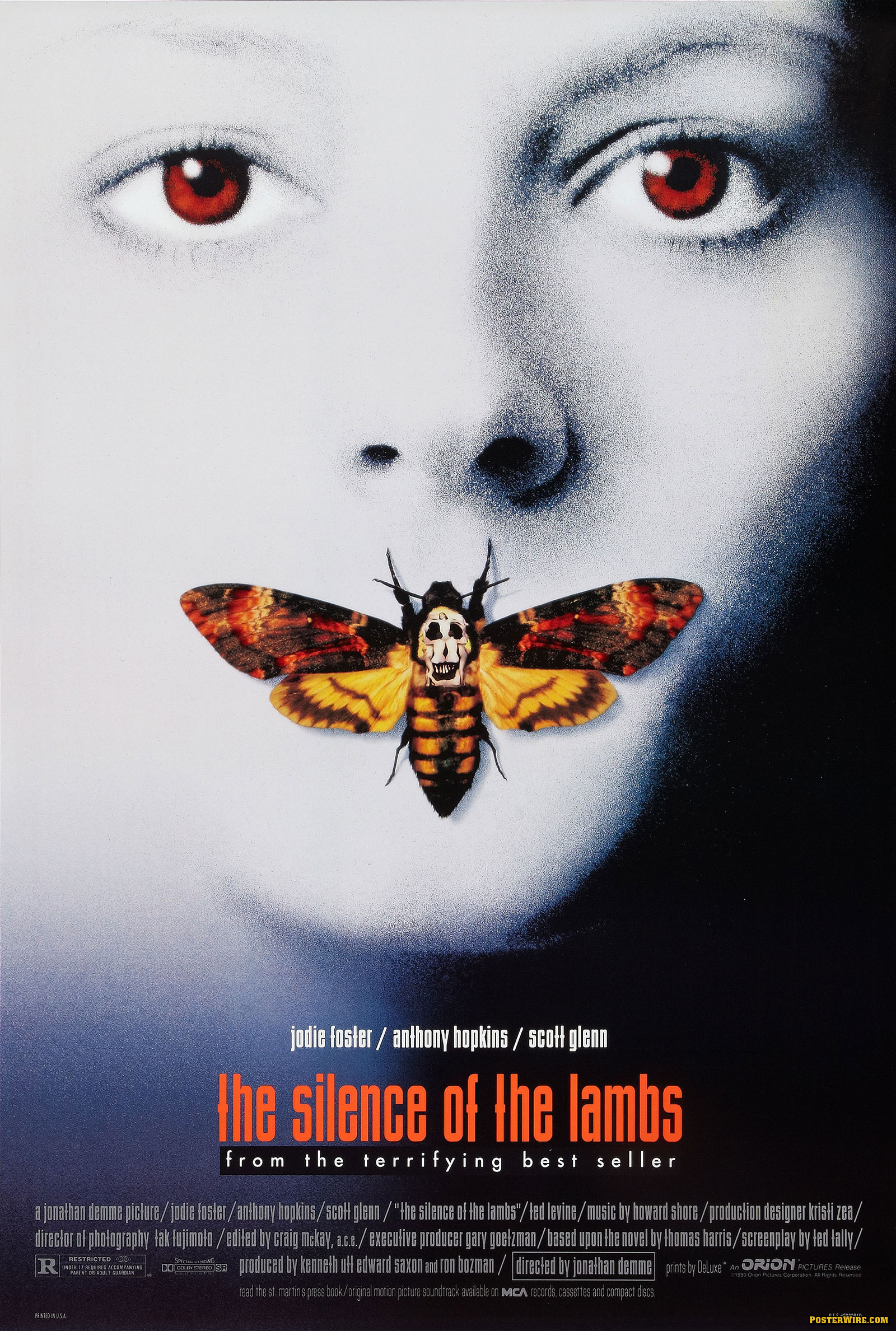
Furthermore this genre theorist can relate to out narrative because of the fact that we've repeated elements of a psychological thriller movie for example scientific elements such as experiments, laboratory clothing and equipment which was also done in Hannibal Rising movie which was also shown in the trailer where Hannibal was wearing a laboratory jacket in a laboratory room. Another repetitive element is that our main character has psychological problems and is mentally unstable which is shown in many movies within this genre such as The silence of the lambs, Hannibal Rising, and Black Swan where the main character of the movie had psychological problems which made her mentally unstable.

A difference for us is that he is able to get justice in the narrative in a peaceful way which challenges the hegemony of this genre because of the time the character ends up getting revenge for example in Hannibal Rising, the main character get's his justice by violent acts used in revenge. So our narrative playing out in this way shows how we made a difference and became a counter hegemony.

'Genres should not be understood as rules or restrictions'
This quote made by Henry Jenkins means that a movie representing a genre can fulfill it's full representation when being undermined by rules and restrictions. If a psychological thriller had to restrict what to put that is part of the norms and values of the genre then it will be hard for the movie normally to represent it's genre through it's narrative.