1.jpg)
Thursday, 7 May 2015

Friday, 1 May 2015

How effective is the combination of your main products and ancillary texts?
Furthermore with the costume in all 3 media products, the protagonist is wearing the crucifix chain which helps the 3 media products link together. In addition the crucifix represents religion and religion is part of the binary opposition which is science vs religion and because the binary opposition is easily recognizable, the chain will help the audience recognize the film from just chain because they are all in the three media products, and it's represents religion which is part of the binary opposition.
The teaser trailer's scenes were dark which creates a link between the magazine and film poster because the magazine front cover and the film poster has a dark background due to the use of the color black and dark grey which creates a link due to the use of the colours.
Furthermore making the font the same as well as using the same costume for all three media products and the same dark colors in all three media products makes sense because of the fact that a cultural capital in psychological thriller will know that psychological thriller movies in their media products use the same font such as Red Dragon. Red Dragon used the same font in both their trailer and the poster which also influenced my group and I do this for our media products. It also helps the audience understand that these media products are linked together and part of the promotional film packaging. If we didn't then it wouldn't make our promotional film packaging look professional due to the different fonts being used and having no sort of linkage between the media products which is why it's essential to use the font and other features to link all the media products so the audience can know that they are all part of the promotional film packaging.
The costume was the same in all three media products which creates a link between the media products and showing the audience that they are part of the same promotional film packaging. In addition it would make sense to make the model have the same costume in all three media products because people could just use the costume to identify the film.
The teaser trailer's scenes were dark which creates a link between the magazine and film poster because the magazine front cover and the film poster has a dark background due to the use of the color black and dark grey which creates a link due to the use of the colours.
Furthermore making the font the same as well as using the same costume for all three media products and the same dark colors in all three media products makes sense because of the fact that a cultural capital in psychological thriller will know that psychological thriller movies in their media products use the same font such as Red Dragon. Red Dragon used the same font in both their trailer and the poster which also influenced my group and I do this for our media products. It also helps the audience understand that these media products are linked together and part of the promotional film packaging. If we didn't then it wouldn't make our promotional film packaging look professional due to the different fonts being used and having no sort of linkage between the media products which is why it's essential to use the font and other features to link all the media products so the audience can know that they are all part of the promotional film packaging.
The costume was the same in all three media products which creates a link between the media products and showing the audience that they are part of the same promotional film packaging. In addition it would make sense to make the model have the same costume in all three media products because people could just use the costume to identify the film.
Wednesday, 29 April 2015
Question 3: What Have You Learned From Your Audience Feedback?
Poster
We showed a draft of our poster to a focus group raging
of 10-12, 17+yrs. There were a mixture of psychological thriller fanatics and
those who were more for the mainstream content such as super hero action film,
which we believed will give us the best feedback as to what conventions will
appeal more to a fanatic audience and what could those who are more about the
flashy suits can comment on how our dark themed poster can reach out and
attract them.
The feedback we received were about how we can change
the font of the masthead. An interesting topic someone suggested was the photo
used, we told everyone it was a place holder and they said it was a good photo.
They liked the use of the crucifix being highlighted which was a prop we never
meant to even bring in and said we should get a more interesting pose for our
protagonist to draw them in more. We took on this feedback and applied it
towards our new draft.

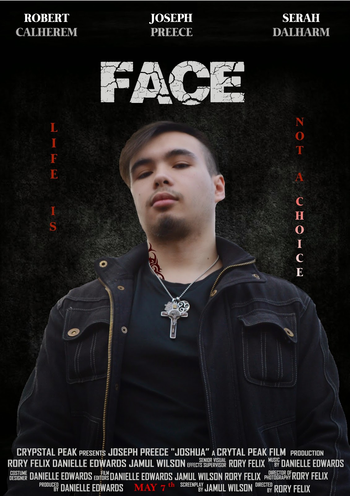
As you can see we applied some effects to make it more
interesting for our audience such as adding the main focus of our project the
tattoo. Also from the feedback we got there were comments of our model having a
glow outline which was contrasting the dark background, I made changes and is
now fixed.
Trailer
We went out to our target audience to get feedback on
what their opinion are on the film. We also did this for the poster which
proved to be helpful for us in our development and continued to help it in our
trailer. As said from the feedback we re-recorded some scenes that were really
bad such as the bathroom scene and some of the torture scenes.


As you can see here on the left is the previous shots
from the trailer and the new ones we took are on the right which are at a
better quality and the focus is not too off. You can also see the brightness is
better for viewing as well.
Monday, 27 April 2015
Tuesday, 21 April 2015
My magazine Development Draft#1

In this draft I need to fix my bar code and change a few sell-lines. The main problem I have here is my text being hard to read from the background meaning I may have to change the photo, crop it or as seen to other independent magazines I will blur the background which could male reading easier.
Friday, 17 April 2015
Thursday, 16 April 2015
Wednesday, 15 April 2015


Tuesday, 14 April 2015
Sunday, 12 April 2015

Saturday, 11 April 2015
Final Poster Notes
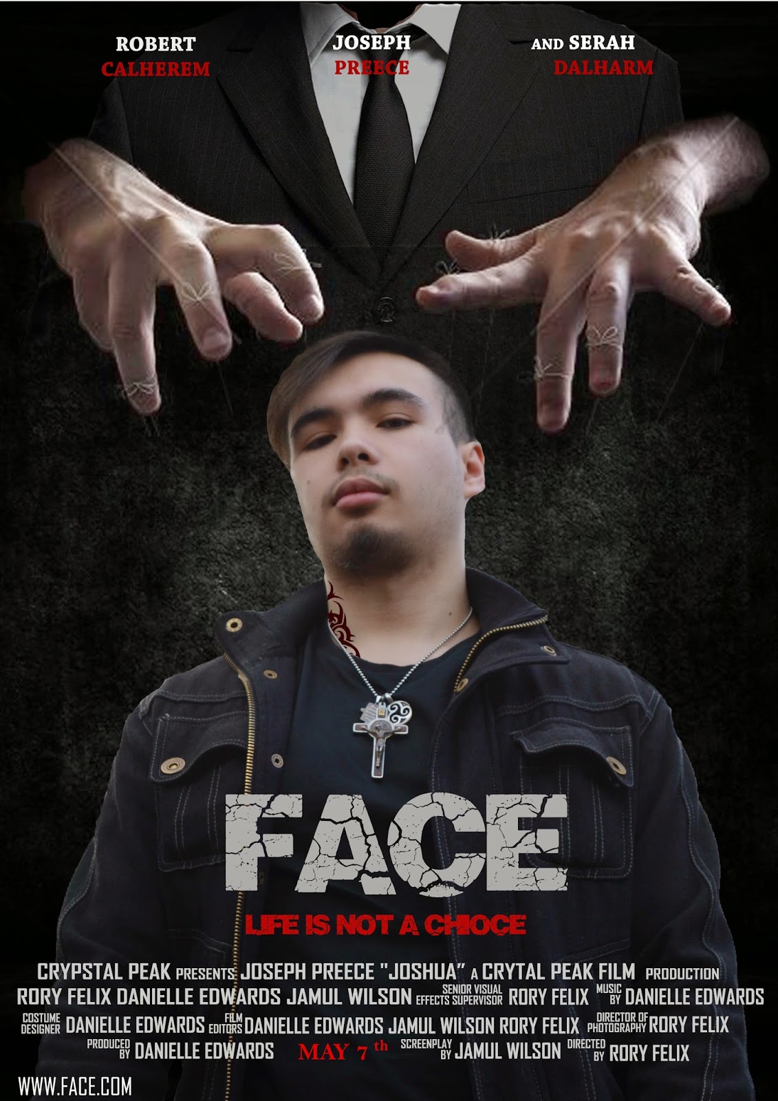 After looking at more psychological thriller posters as I felt that I was shifting away from our genre I realised that most posters seem to have there masthead placed in the middle and When I try that our poster seems bland at the top area. I'll place the slogan there, however it would just look weird and misplaced. This is why I created a puppeteer at the top to create something more interesting and to fill in the blank face. The hands were a separate image and I had to find a suit that I can lower the opacity to fit in the background and create mystery to whose controlling the strings. This gave me an easy option to place the slogan beneath the masthead and gave it a red colour to draw more attention.
 The star names are better to read and I like the use of the white and red.
Friday, 10 April 2015
Subscribe to:
Posts (Atom)