Background/Foreground:
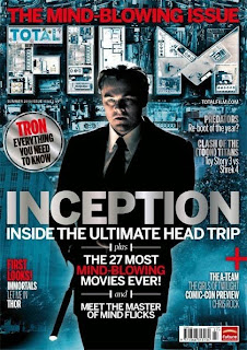
The background for a mainstream film magazine evidently shows that it has been made with better technology compared to a independent film magazine. The reason is that they can afford it unlike a independent film magazine maker. Furthermore The background uses de saturated colours such as blue which is also a cold colour. The reason they use a cold colour pallet because the movie is suppose to set a cold, mysterious atmosphere for the audience, in addition it easily watches the target audience eyes out. In addition they have buildings in he background which relates to the film because they are part of one the scenes, second of all it makes it more interesting and exciting rather then having plain de saturated blue background. The fore ground is showing one of the characters in a suit holding a rifle.
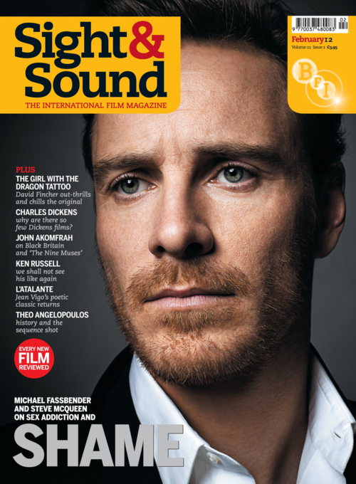
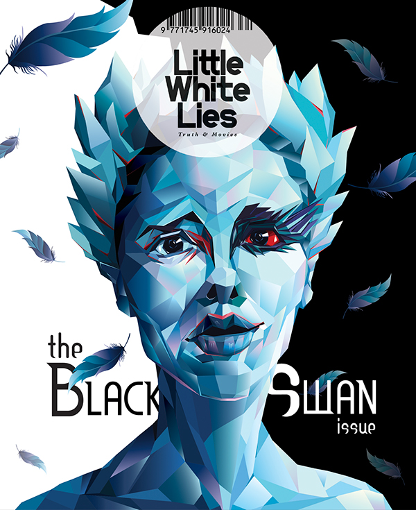
BFI Sight and Sound is an independent film magazine that is presenting individuals called Ewan Mcgregor and Hitchcock. The magazine shows that is hasn't got the luxurious amount of technology. For example the background colour has no special effects like total film, the Ewan Mcgregor magazine has a gradient silver/white colour. The magazine didn't use the same skills for the background for example using a location of a scene as part of the background like what Inception did or making the background intriguing like the hunger games feature. This does make it less attractive because with the background like Inceptions' it makes it stand out more. But with the BFI Sight and Sound magazine background it could force the magazine to blend in with other magazines or just be ignored completely by audiences. A foreground shows a man called Ewan Mcgregor however it doesn't really look impressive compare to the 'Total Film Magazine'. The BFI Sight and Sound makes the image look like that the designer just took a picture of the individual than just stuck it on the front of the magazine. Their are no special effects to the character to give him an edgy appearance like the Inception character being presented. However Little White Lies tend to have an artistic background for the magazine for the 'Road issue' one has made the colours more artistic. This does make the magazine more intriguing and eye catching. The foreground shows the main people faturing in the magazine with an artistic look such as Natalie Portman from the Black Swan is cover with artistic colours that cover the whole of her face.
Total Film magazine has more of a graphical title that increases the aesthetics of the magazine by making it more appealing and unique in a positive way. They use a font on the masthead to make it more bold and attractive as well as using a bird eye view of buildings in heir masthead to make it relate more the movie and blend with the magazine. They also put the first part of the masthead 'total' in the first letter of the second part. For their sell lines they use more of a geeky font probably because the target audience also consist of people who would be considered geeks/nerds.
BFI Sight and Sound masthead compared to Total film looks average. It's bold and black which may catch the eyes of their target audience but it looks boring due to no special effects like 'Total Film' Probably because of the restriction of technology they have. Once again it's probably because of their budget, not being able to get high technology/computer software as well as high standard skill people to manufacture the magazine. The magazine does have sell lines but not ones that relate to other movies like Inception. But they use a basic font for the sell lines with a different font for the sub headings that seem similar to the ones on Adobe Photoshop. However the magazine Little White Lines tend to have more of an artistic font which is used to support the theme of their from cover.
Sell lines
On mainstream film magazines the sell lines on the front cover makes it look more busy and fills up the space on the cover for example total film spiderman edition has sell lines as well as an advert of posters coming across the magazines. Plus all three of the magazines have puffs covering the left side of the magazine.
 Independent film magazines such as BFI Sight and sound have sell lines covering the left side of the page but look boring compared to a mainstream film magazines. In addition the magazines with the independent industries tend to not advertise films in their sell lines like the way total film does, for example BFI Sight and Sound have Charles Dickens and Total film for Inception is featuring the movie called Predators. Little White Lies don't have sell lines, probably because they do not have the right to speak about films or because they want to make their covers more graphical and artistic than placing a bunch of sell lines all over the cover. In addition the sell lines uses serif fonts and are predominately small on the page where as the font size on the mainstream magazines are more big and bold.
Colours
Total film magazine uses a de saturated blue as the background which makes it more appealing and exciting. They also had the technology to establish this. The colour blue is also part of the cold colour pallet which was probably used to represent the tone of this film which is suppose to be cold because of the atmosphere that revolves around this film. They use the colour red for part of the sell lines as well as white which goes well with the background and eachother.
 Little White lies use more of a artistic approach to their magazines. But the colours that feature on the magazines I find are either cold colours such as blue, purple and that is the one for the 'Black Swan'. The reason they may of use those colours is to give the audience a cold tone due to the cold atmosphere revolving around this movie. Just like the one with the quote' Road issue'. The other Little White lies magazine is using the colour black which is probably to give a dark atmosphere amongst the magazine. The other independent film magazines such as BFI Sight and Sound tend to use basic colours. Probably because of the restriction they have to technology that mainstream film magazines have no problem getting. The magazines look like that they have been manufactured on computer software such as Adobe Phtotshop due to gradient background that one the magazines use and the lack of special effects that the magazine have.

No comments:
Post a Comment